USAFacts
A trustworthy source for civic engagement

Technology
Making government
data easy to understand
The United States government is vast in scope and spending. It serves 321 million people across 90,000 jurisdictions, spending more than $5 trillion a year.
The United States government is vast in scope and spending. It serves 321 million people across 90,000 jurisdictions, spending more than $5 trillion a year.
When USAFacts launched, more than 2.5 million people visited the site in the first 24 hours, a testament to the demand for a resource that helps people explore and understand government data and its impact.

“[USAFacts] looks nothing like its bureaucratic counterparts or startups like OpenGov, which also tries to organize and parse government data. Its typeface is pleasingly legible. The site navigation is intuitive. But most importantly, Artefact has made dry facts and figures actually feel engaging.”

Uniting an unprecedented
amount of data in one place
USAFacts aggregates the data of more than 60 different government agencies, from the US Census to the Bureau of Labor Statistics. To manage these huge quantities of information, we designed a website framework that brings a structured, unified feel to the data, allowing for easy exploration and understanding.
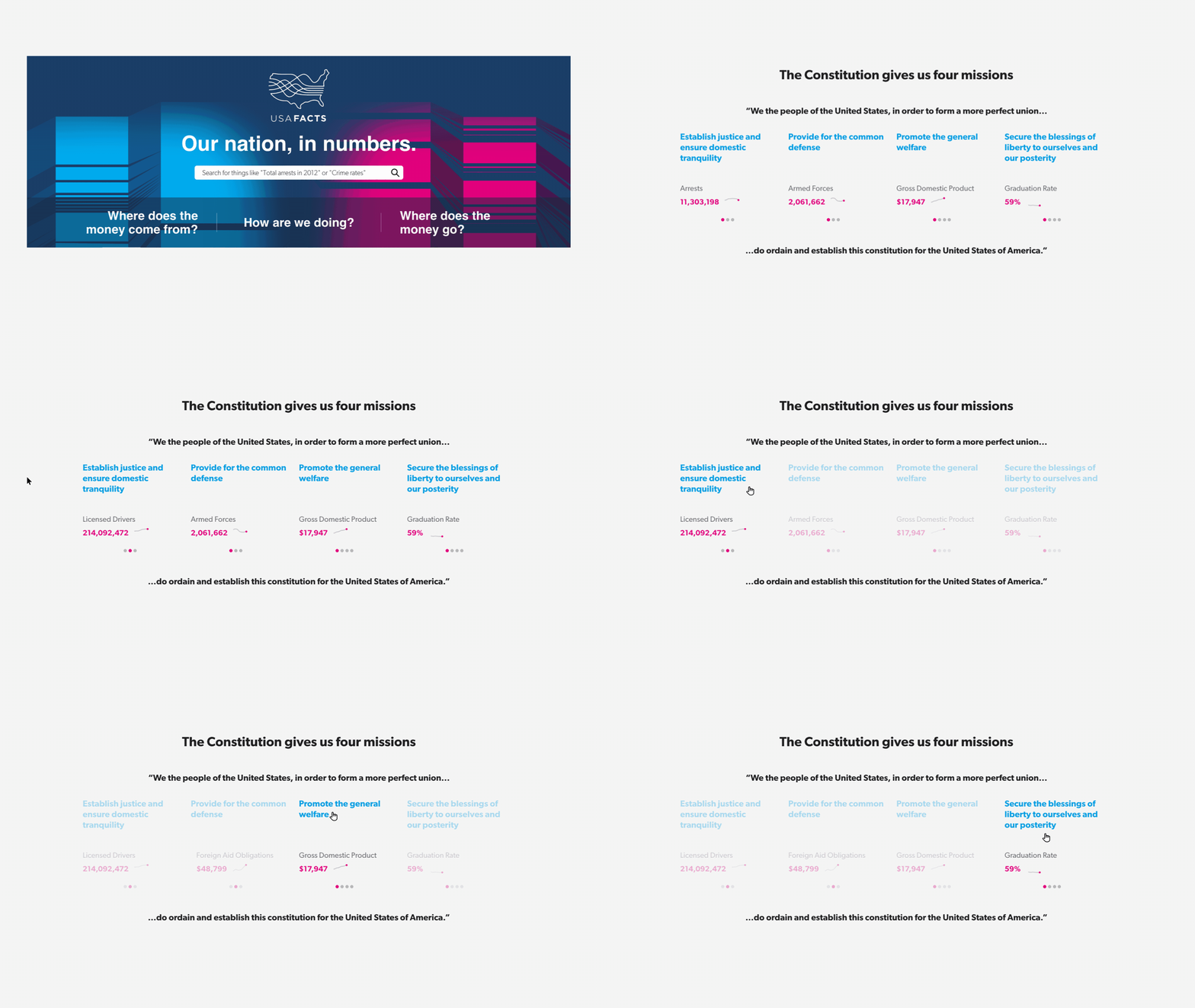
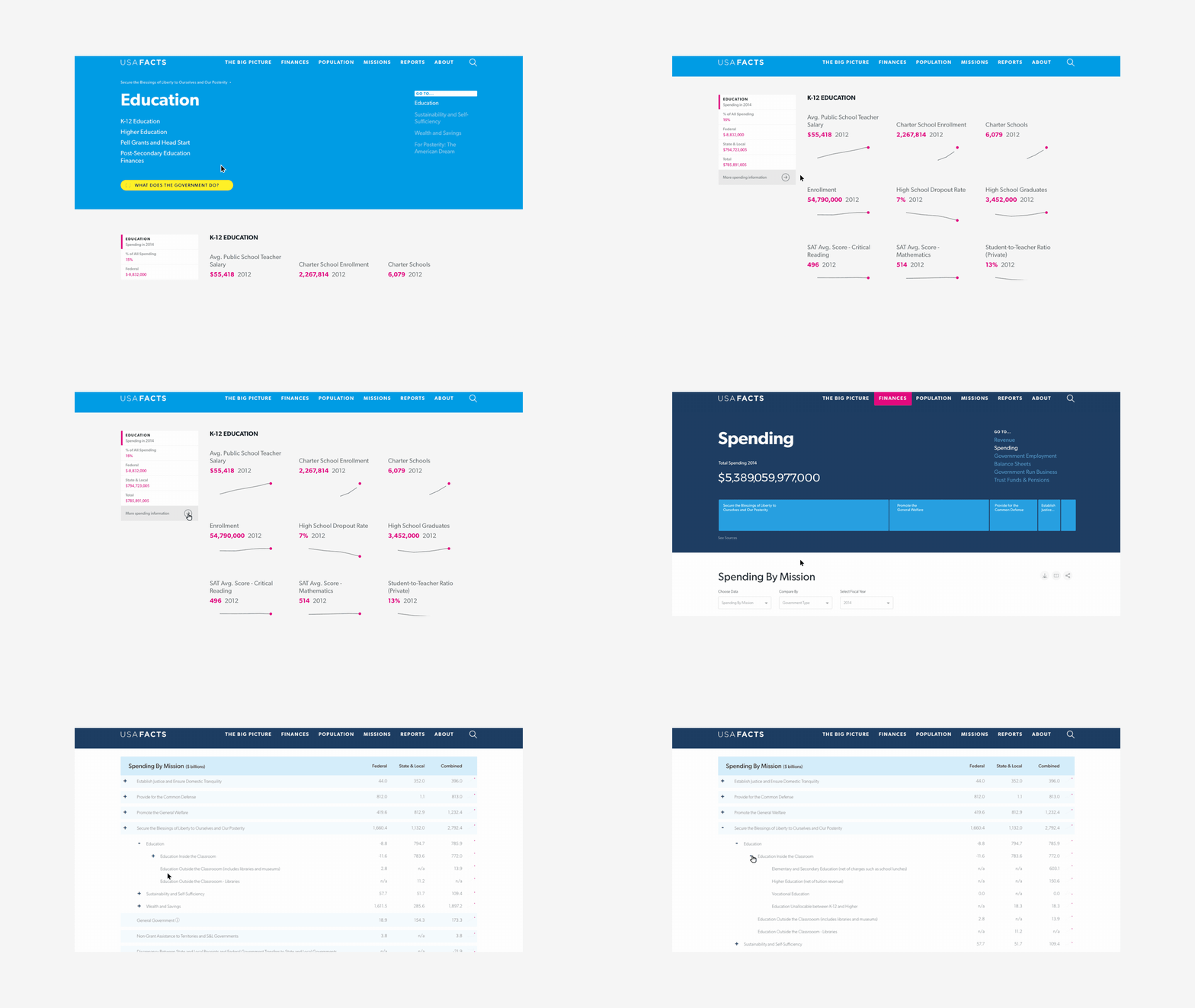
The framework organizes the information around the central missions of government: establishing justice, ensuring domestic tranquility, providing for the common defense, promoting the general welfare, and securing the blessings of liberty to ourselves and our posterity. Visitors to the site start exploring the data at the highest level possible: overall revenue and spending. From there, they can dive deeper into more specific subject areas, like education or defense spending. Within these categories, users can dial in on the data from different perspectives and through different filters, drawing their own conclusions and forming a deeper understanding of government impact.

Bringing clarity and comprehension to complexity
Dozens of government agencies report data on different websites in a wide range of formats, from charts to tables to spreadsheets. Sifting through lines in spreadsheets to determine spending can be daunting even for experienced policymakers and journalists. USAFacts strives to make government data not just easier to find, but easier for everyone to understand.
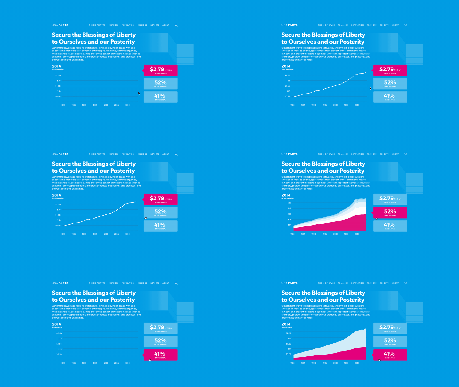
To accomplish this, we designed a cohesive set of data visualizations that makes complex data clearer and more comprehensible. These visualizations scale across the website, bringing disparate data sets under the same unified organization and design. Data visualizations like flow diagrams and sparklines transform dense spreadsheets and convoluted charts into crisp, clean visuals so that numbers can be understood at a glance. These visualizations also offer interactive elements that help users digest the data, such as pop-up annotations and the ability to see changes over time.

Without context, even good data can be misleading or misunderstood.
Data visualizations can make information easier to understand, but without context, even good data can be misleading or misunderstood. Because USAFacts strives to reduce confusion and increase comprehension, it is crucial that the website presents information without stripping away the context that gives the data meaning.
To retain context, the USAFacts website design allows exploration into detailed datasets while keeping the bigger picture in sight. When you explore a specific trend, USAFacts.org places related spending and measures alongside for perspective. For instance, you can view all employment data and then examine employment by age group, or compare education spending with graduation rates. The result is unlike any other data sites because the contextual design of USAFacts.org allows users to comprehend scale and relationships in addition to facts and figures.

We want users to draw their own conclusions, so we let the numbers speak for themselves.
Many times, data visualizations are used to tell a story—think of the common infographic. And yet, because the goal of USAFacts is to be unbiased and objective, our design crucially avoids storytelling and editorializing. We want users to draw their own conclusions, so we let the numbers speak for themselves.
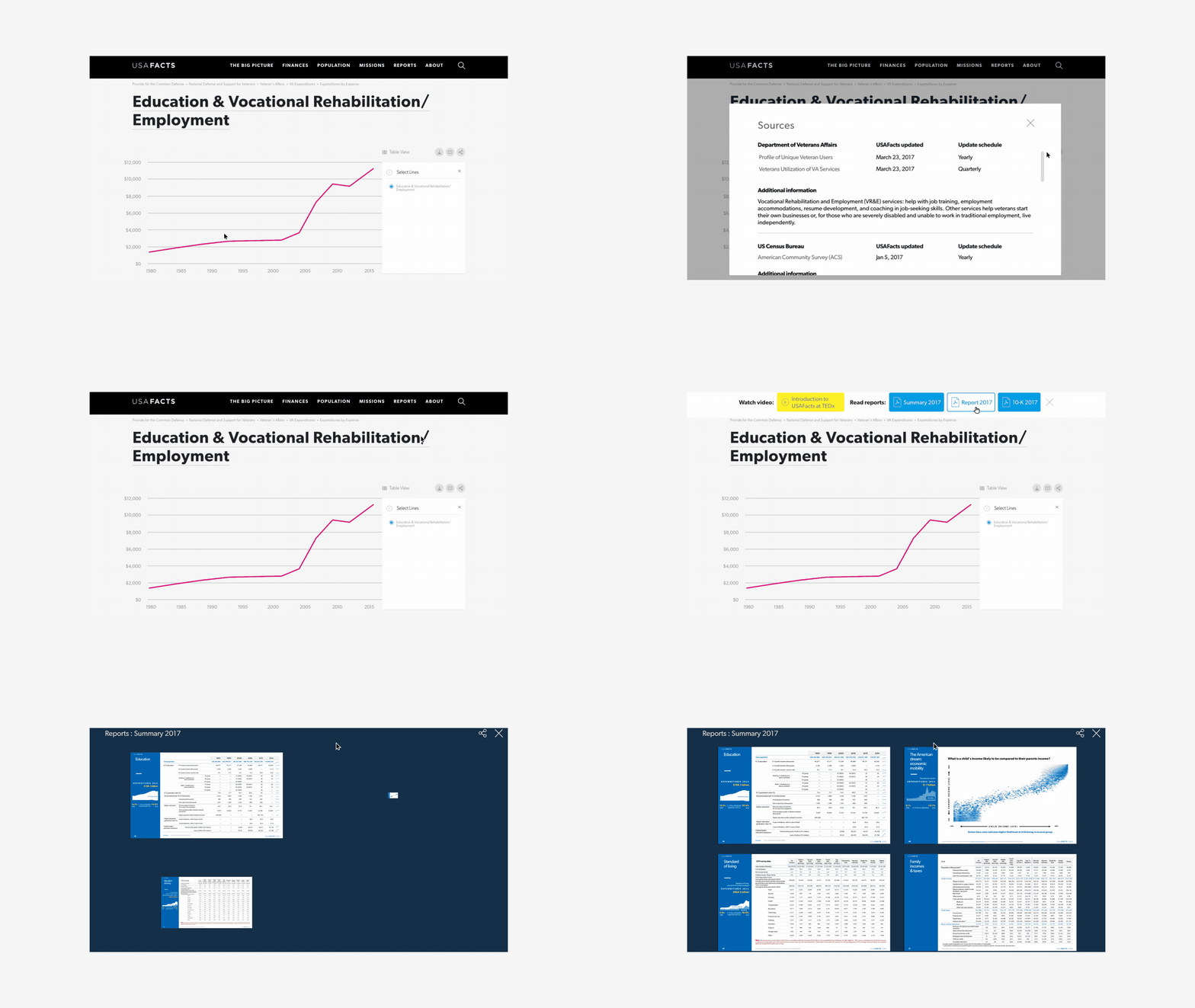
Although the data visualizations are minimalistic and engaging, each has a source button that enables users to easily verify all the information for themselves. The source button links to original data sets and provides information on publication dates. It also directs people to the government agencies involved so they can continue their research. What’s more, a whole section of the site is devoted to explaining the choices and methodology used to organize the government data. As a result, the design of USAFacts reinforces the credibility and trustworthiness of the initiative.
What we delivered
+ Generative research
+ Foresight
+ Concept envisioning
+ Experience design
USAFacts in the news
The New York Times
The Economist
Next project
The Tarot Cards of Tech