Juice Box
A concept to empower the developing world
Technology
Safe and reliable access to electrical power, no matter where you live.
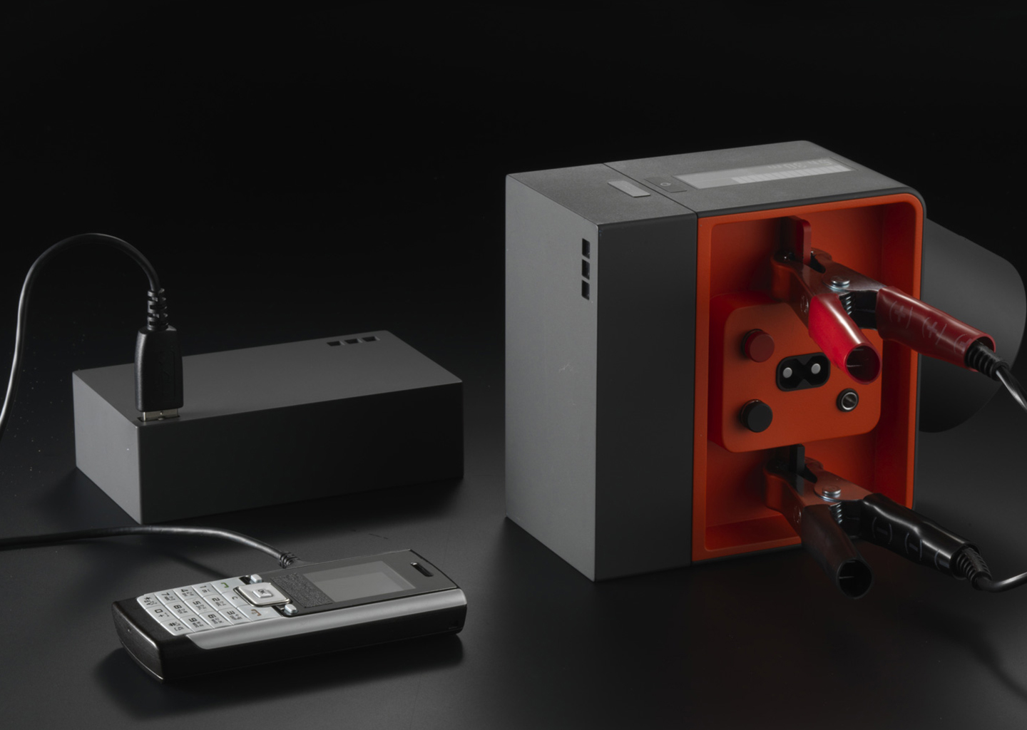
Juice Box is an open energy system concept that allows people to capture energy from multiple sources, store and transport it to where it is needed, and power devices even in the remotest locations.
Designed to be flexible, Juice Box supports multiple energy sources—from the electrical grid, to solar, car battery, or even kinetic. It is our vision for a simple device that gives people, regardless of where they live, safe and reliable access to much-needed electrical power.
We centered the design on human needs to improves one’s ability to work, learn, get access to information, create better living conditions, or begin new business opportunities.
“From set top boxes to mobile UIs, the Seattle design firm Artefact is justly proud of its tech savvy. So when guest editor Bill Gates wished for a recharge-anywhere power source, we went to Artefact for help.”
How can we bring electricity to 1.2 billion people who live without it?
More than one billion people, or 20% of the world’s population, live without electricity. Vast rural areas in Africa and Asia are without power, limiting access to education, health, safety, and social mobility. Simply put, lack of electricity means permanent poverty. While the places where people live without electricity vary widely—in natural resources and seasons, they share a technical ingenuity, an entrepreneurial spirit, and a sense of community. Our challenge was to design a solution that addresses the energy access problem for the largest number of people possible in a way that gives them the freedom to build a better future. Our timeline was four weeks.
“1.2 billion people live off the power grid. This prototype from Artefact could make a big difference for them.”

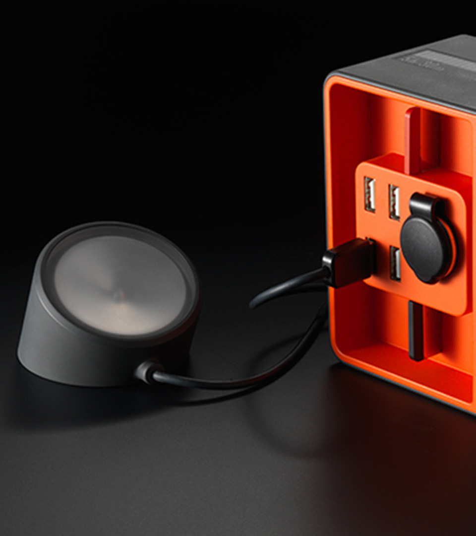
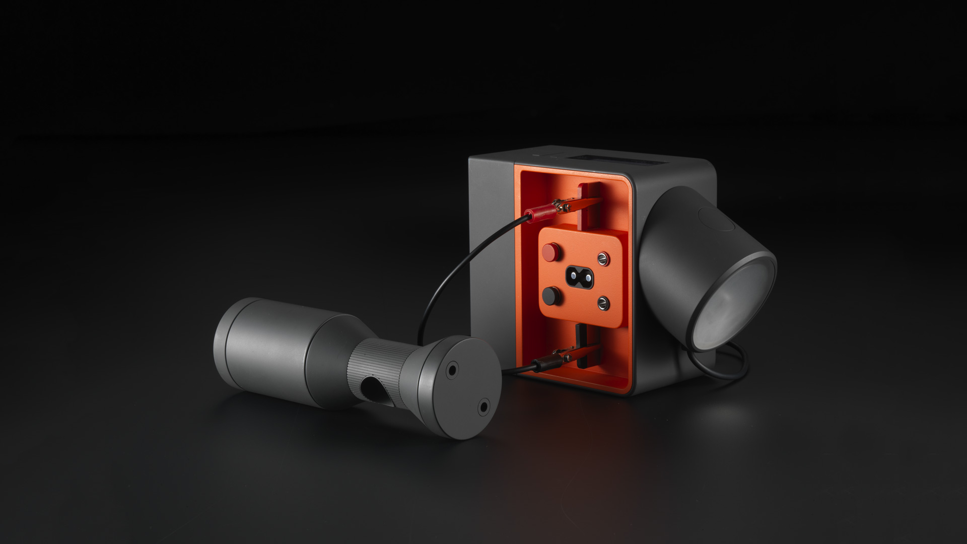
Detachable LED light
The detachable light has versatile settings for task and ambient lighting, enabling people to work or study after dark.

Swappable and stackable batteries
Swappable batteries with a USB port can be stacked together for extra energy or rented out, creating new business opportunities.

Source-agnostic input panel
The input panel safely connects to multiple sources, including raw cables.

Multiple outputs, immediate impact
Multiple outputs could power phones or tablets, a smoke-free stove, air purifiers, medicine refrigerators, and more – all improving the health of families.

Never powerless
A clear display calculates time remaining so people can plan ahead. An attachable dynamo harnesses kinetic power and enables manual charging in emergencies.
Juice Box in the news
Next project
Storyboard VR