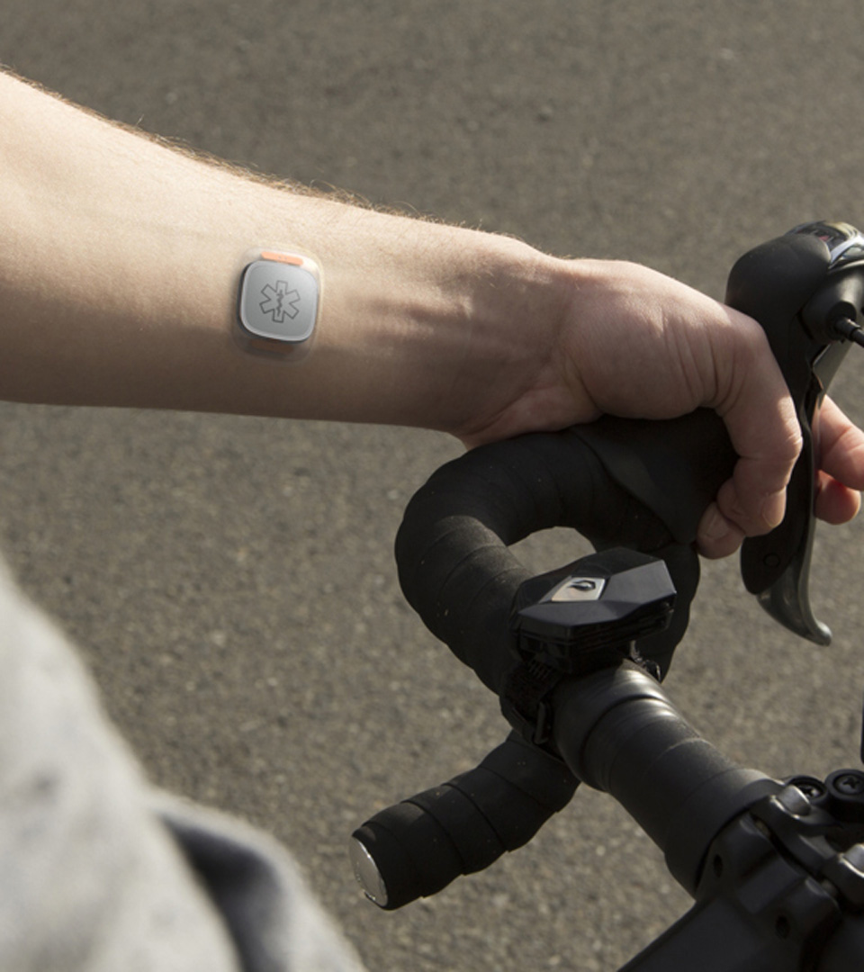
Most teenagers and young adults worry about finishing homework, finding the right college or landing that first post-grad gig. But for young people diagnosed with a serious illness like cancer or a chronic condition like Type 1 diabetes, life takes on an entirely new dimension of difficult emotions. The doctors at Seattle Children’s Hospital have seen firsthand the toll a serious medical diagnosis can take on the young people they treat, and they know maintaining hope can be crucial to their patient’s care. That’s why Dr. Abby R. Rosenberg and Dr. Joyce Yi-Frazier developed PRISM, an emotional wellbeing program that helps young patients build resilience and manage stress in the face of serious conditions.
Seattle Children’s Hospital is at the forefront of treating the physical and emotional health of patients holistically as well as in harnessing the potential of digital health interventions. When Seattle Children’s recognized the potential of PRISM as an app for patients, they turned to Artefact to design a convenient and trustworthy digital version of the PRISM program.
Designing a companion for a difficult journey
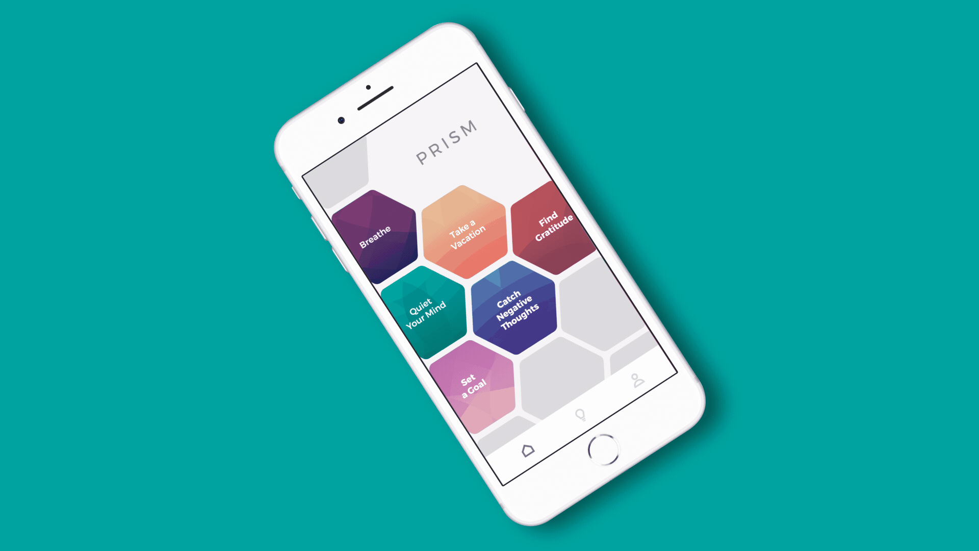
Working collaboratively with the Seattle Children’s Hospital Digital Health team and General UI, we transformed the in-person, all-paper PRISM program into a self-guided experience on the patient’s smartphone. The framework for the app was informed by Seattle Children’s medical research and expertise in helping young patients develop skills in four areas: stress management and mindfulness, goal setting and problem solving, positive reappraisals, and finding meaning in adversity. The app is a portal into these skills, providing a place where adolescents and young adults can be open and forthright about their stress, worries, hopes and goals as they manage the challenges of serious illness.
An engaging user experience was paramount because the PRISM app is designed for teenagers and young adults and deals with difficult emotions. PRISM welcomes users with thoughtful interactions, a rich tactical and interactive navigation experience, a conversational tone, a youthful aesthetic, and none of the clinical, sterile feel found in many digital health solutions. Because the app allows for the patient to serve as their own facilitator, we designed prompts throughout the experience to inspire self-reflection and the honest expression of emotions, as well as space for patients to reflect on goals and moments of gratitude. Altogether, the PRISM app provides young patients a listening ear and a moment of calm when they need it most.
A new frontier in digital health
The PRISM intervention is a powerful example of healthcare viewed not just through a medical and physical lens, but by recognizing the personal and emotional journey of patients. And in app form, PRISM demonstrates the huge potential of digital healthcare solutions, thanks to its scalability, portability, and prospective application across many types of patients and conditions. As Seattle Children’s pilots the PRISM app, we remain inspired by the incredible work of all the practitioners and patients who made PRISM a reality with their perseverance, optimism and hope.
“With Artefact’s elite design skills, General UI’s architecture and Dr. Rosenberg’s fastidious research, we have a marriage of unique skills that allow us to leverage the PRISM program to reduce suffering not just here in Seattle but for teens and families experiencing stress and illness elsewhere, too. The partnership affords us a chance to reduce suffering at scale and we’re thankful to begin the work and iteration process to understand how to support even more children and their families.”
Thousands of students from African countries pursue their education each year through the support of The MasterCard Foundation Scholars Program. Becoming a MasterCard Foundation Scholar can be a life-changing moment that opens up opportunities to study at top universities in Africa and around the world. Madit grew up in a farming community in South Sudan during a time of civil war. As a MasterCard Foundation Scholar, he is now studying business, economics, and public policy so that he can set up a college preparatory program in his home country after graduation. Stories like Madit’s are what make The MasterCard Foundation Scholars Program such a powerful and transformative program for the next generation of African leaders.
MasterCard Foundation Scholars are driven academically and dedicated to their education, but the experience of adapting to life at university can be daunting without a support system. The need for support continues after graduation as well. Many Scholars return home to lead change within their communities, but require connections to resources, collaboration with others and continued education to accomplish their goals.
Together with Arizona State University and The MasterCard Foundation, we set out to design a community that would support Scholars throughout their education and set them up for success long after graduation. The result was Baobab, a social learning platform that elevates scholarship into a source of lifelong learning and empowers the next generation of African leaders to create social change.
Baobab: a new kind of social network
Named after “Africa’s Tree,” Baobab is a social learning platform where Scholars gather to share knowledge, exchange ideas and learn from each other. It fosters connection and collaboration within the Scholar community, provides a curated learning environment, and maximizes mentorship opportunities.
Throughout every step of the design process, Scholars provided direct input into what they were looking for and needed from Baobab, and we used their experiences studying at university and returning home to inform our design process. MasterCard Foundation Scholars expressed that the Baobab experience would need to prioritize conversation around real issues, make opportunities and mentors more accessible, and provide resources for continued learning. As a result, Baobab is built on principles of inclusivity, community, and connection. All of these design principles keep Scholars at the front and center of Baobab and give the platform purpose beyond the typical social network.
“Our cross-sector collaboration with Artefact and The MasterCard Foundation pushed the limits of a first-of-its-kind social learning platform. Together, we draw upon the strengths and expertise of a foundation, university, and design firm to create a global force for change.”
Bethany Wiegele
Director of Lifelong Learning Initiatives, Arizona State University
Sparking conversations and community
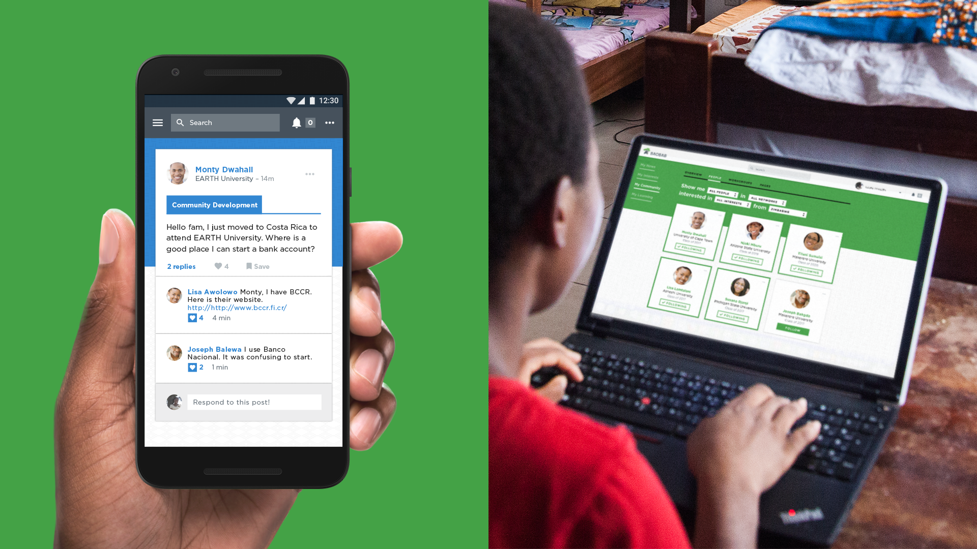
Community and connection are central to Baobab. Before Baobab, Scholars had no way to easily connect with fellow Scholars involved in The MasterCard Foundation across campuses and programs. One Scholar recalled finding out about his scholarship and being so excited to connect with others in the program that he spent hours scouring Facebook just to find other students with African names. Baobab acts as a digital rolodex, giving Scholars instant access to a community of students like them who share their experiences and can serve as a built-in support system as they adjust to life in a new location.
Scholars said that using social networks like Facebook often felt intimidating and unfocused due to an overwhelming amount of content that blurred serious subjects with personal sharing. We therefore designed Baobab to look and feel streamlined and structured. Rather than asking Scholars to just “share,” we designed sharing around specific prompts that act as a guide for Scholars and encourage concrete ways to start conversations. For instance, Baobab asks Scholars questions like “Who is a leader that inspires you?” and “What is something positive that you have achieved this week?” provide structure to sharing so Scholars feel more inclined to add their voice. As a result, Baobab has become a lively forum for Scholars to discuss anything from how to register for classes to economic policies shaping Africa.
Connecting Scholars with experience and expertise
Upon returning to their home countries, many Scholars experience financial instability, barriers to networking and unemployment rates that can surpass 30 percent. For them, Baobab needed to go beyond the normal conversations and sharing of social networks: it should also be a conduit to career growth, professional development and mentorship connections.
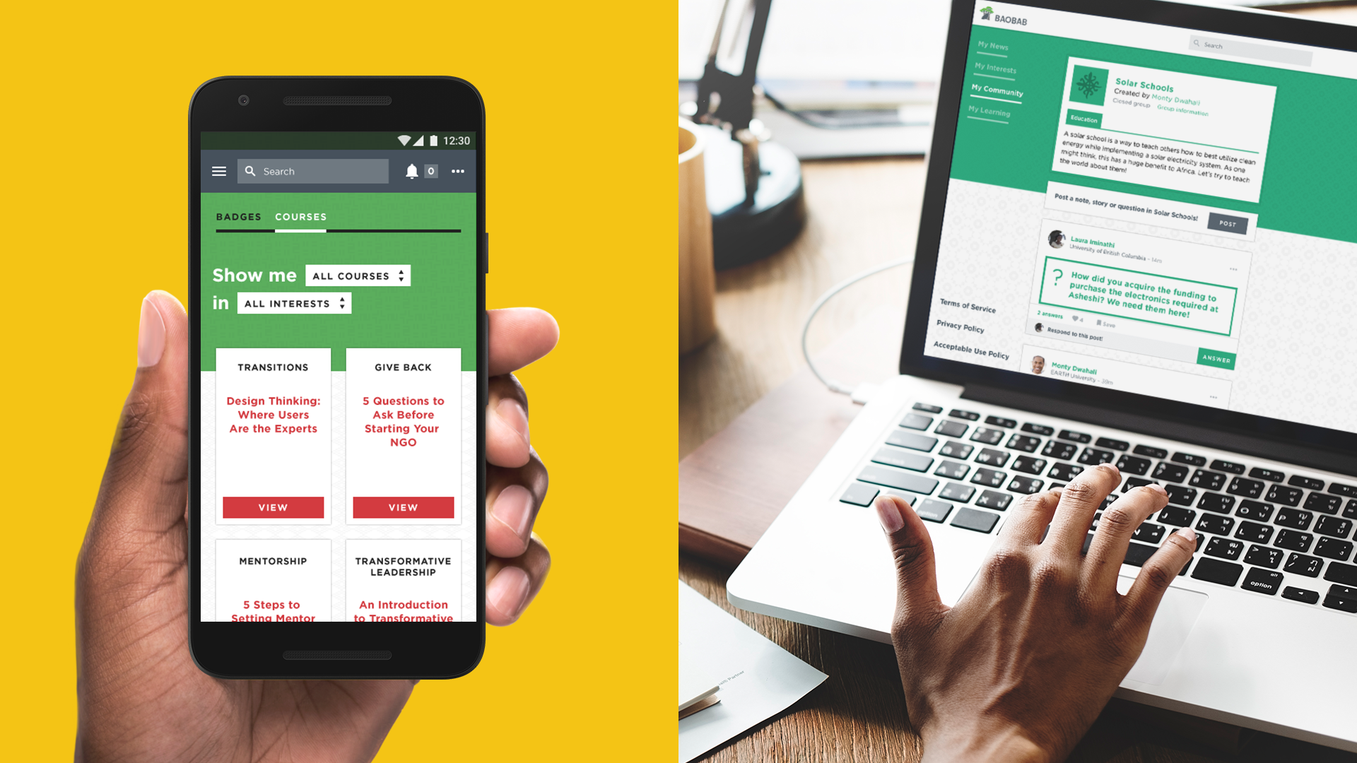
We designed space within Baobab for Scholars to meet career mentors and find job opportunities to accelerate their success once Scholars return home. Specially invited African business and community leaders participate in Baobab as mentors and chat directly with Scholars, answer their questions and provide valuable professional advice. Mentors have shared insights with Scholars on a range of topics, such as how to navigate male-dominated professions. In keeping with the desire for a sense of focus, Baobab provides a curated editorial experience that recommends conversations and connections to Scholars so that they can easily align their personal and professional goals within the platform.
“Before Baobab, I was worried what would happen to me after the scholarship. Would I be able to continue my education? How will I stay connected to all the people I met during my scholarship? Now all that worry is gone. Students are sharing so many great opportunities with each other that I never knew were available, and we can stay connected with each other on Baobab.”
Pauline
MasterCard Foundation Scholar
Lifelong learning and transformative leadership
Scholars are stronger together when they can exchange ideas and learn from each other. With the workgroups feature on Baobab, Scholars can join forces and share resources on common challenges like opening a school in their community or designing initiatives for child healthcare. A growing library of content, like courses in design thinking and transformative leadership, provide Scholars with resources that can help them accomplish their shared goals, boost their resumes, and attract employers.
Scholars can use Baobab as a resource wherever they go because it is designed for quick loading and accessibility in mobile-first, low-bandwidth markets. With resources for lifelong learning and workgroups in your pocket, Baobab helps combine the energy and effort of Scholars as they create change across the African continent and within their own communities.
Today, more than 2,000 Scholars from nearly every sub-Saharan country use Baobab, with thousands of new users becoming eligible each year. Scholars use the platform daily to connect with others, tackle shared challenges and find inspiration and guidance from mentors. Like Africa’s Tree, Baobab is a place for the next generation of African leadership to come together as a collective force for change.
“My level of confidence and curiosity now has greatly improved. This semester I have answered and asked more questions just because I feel confident in airing my views. And Baobab had contributed to that!”
Virtual reality has the potential to change how we consume content.
After years of false starts, the technology is finally sophisticated enough to deliver on its promise to help us forget where we are and allow us to experience things we never thought possible. But as the first generation of virtual reality devices from different manufacturers starts hitting the market, what are the implications for enjoyment, productivity, social interactions, man-machine-interfaces, and health? How will opportunities within these areas help create a preferable future for both VR brands and their customers?
From rehabilitation to virtual robotic surgery, from field trips to Machu Picchu to empathy-building experiences, from enjoying Henry the hedgehog to creating your own magic with Tilt Brush – healthcare, education and media and entertainment are emerging as the areas where VR can have a clear positive impact. But how much more fun would a school trip to Mars be if the kids could see their classmates and interact with them while they are there? Having just created an amazing Tilt Brush artwork, wouldn’t it be great for a kid to be able to make eye contact with her dad to see how he approves? As VR helps us to develop empathy for people afar, will it at the same time numb us in understanding and sharing the feelings of the person next to us?
“Artefact presents two VR headsets that could feasibly exist by 2020– and the medium never looked so promising.”
Fast Company
Mark Wilson, March 28 2016
Bringing others in your virtual reality
While the first generation of VR devices is still concerned with its own usability and usefulness, product features like display resolution, frame rates, product weight, and comfort dominate the conversation, whereas more aspirational aspects like shared experiences, human interactions, and other positive outcomes are much lower on the list of priorities. Using 10,000ft Insights, we mapped out the VR devices that are on the market today or are slated to be shipped later in 2016 according to their immersiveness and inclusiveness. The results are clear — while current products support different levels of immersiveness, they all fall short in bringing other people into the VR experience.
The trajectory for second generation headsets points to increased immersive qualities – the current key ingredient in creating premium VR experiences. Future virtual reality devices will become untethered, smaller, and lighter, and thus more mobile, further “tune out” physical reality with more lifelike 3D video and audio, and stimulate other senses beyond sight and sound.
But what if there was another primary objective in the design of VR hardware to juxtapose the inevitable idea of “immersion” with? We believe that if VR is to have more positive outcomes than pure immersive fun (that will eventually either become tiresome, or lead to not so preferable scenario’s), VR manufacturers need to create affordances for inclusion. Our challenge as designers is to find the right balance between immersion and inclusion for each type of VR product – from the headset aimed at the hard-core gamer, to the device that brings VR content to the mainstream.
Adding the aspect of “inclusion” of others will be instrumental to shaping a preferable future for both VR brands, and their customers. Future inclusive VR experiences will need to allow others to participate in or observe a user’s virtual reality, facilitate the effortless human interaction with others, both in the virtual and physical reality, and enable consumers to comfortably navigate between virtual and physical reality.
On the surface, the ideas of immersion and inclusion seem to be polar opposites. But we believe that VR experiences do not necessarily have to reside on a single spot in the continuum between the two. They can be adaptive to the situation and cover a range of more or less inclusive or immersive experiences. This is what we set out to do – explore how immersion and inclusion might be harmonized in VR hardware experiences for the gaming enthusiast and for the mainstream consumer. The ideas below outline what we believe are not only impactful, but feasible solutions for VR in 2020.
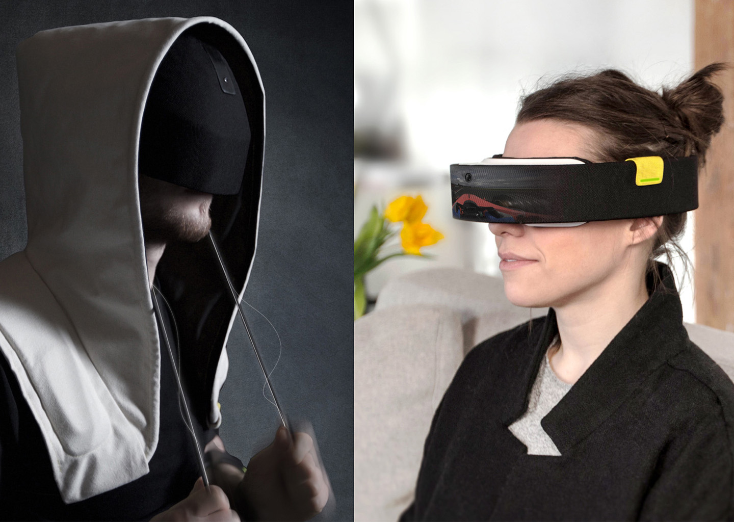
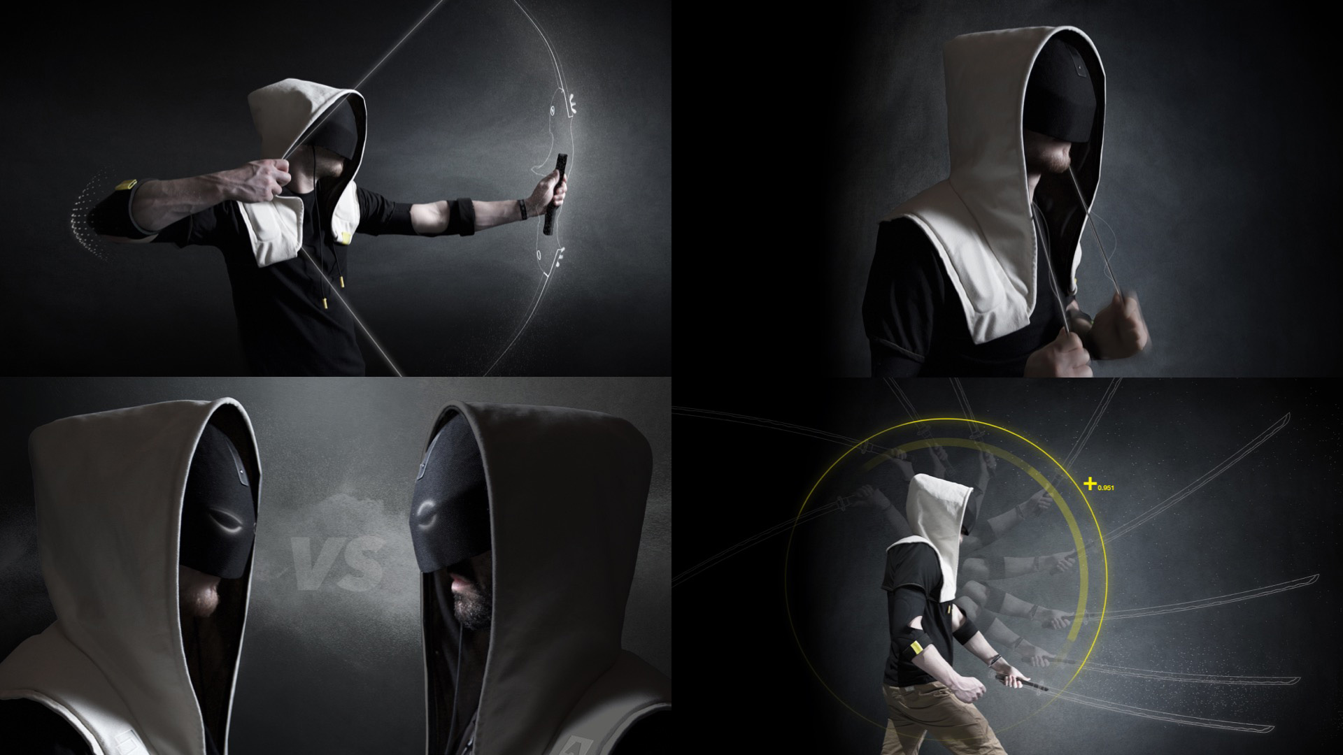
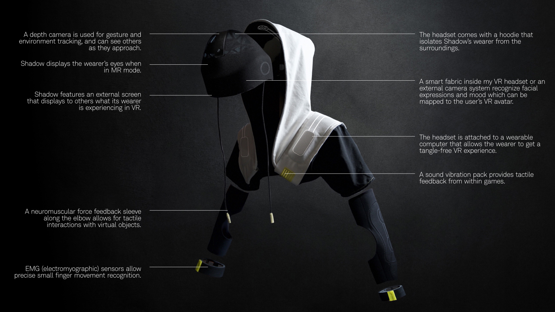
Shadow: Our deepest (shared) secret
Shadow is a suite of VR wearables for gamers who desire the most immersive virtual reality experience and interact with others mainly in the virtual space.
VR immersion
With Shadow, the computer and battery are built into the hood and shoulder cloak, untethering the user from cables (and reality). Immersion extends beyond sight – it incorporates the sense of sight, hearing, and touch. Sensors in the arms, hands and body bring the experience to a new level of ultra-immersion. For the hardcore gamer, inclusion is meaningful primarily in the context of a shared gaming experience. Eye tracking enables Shadow to detect the user’s emotions, which can be reflected through a virtual avatar or using displays within the mask that mimic the user’s eyes.
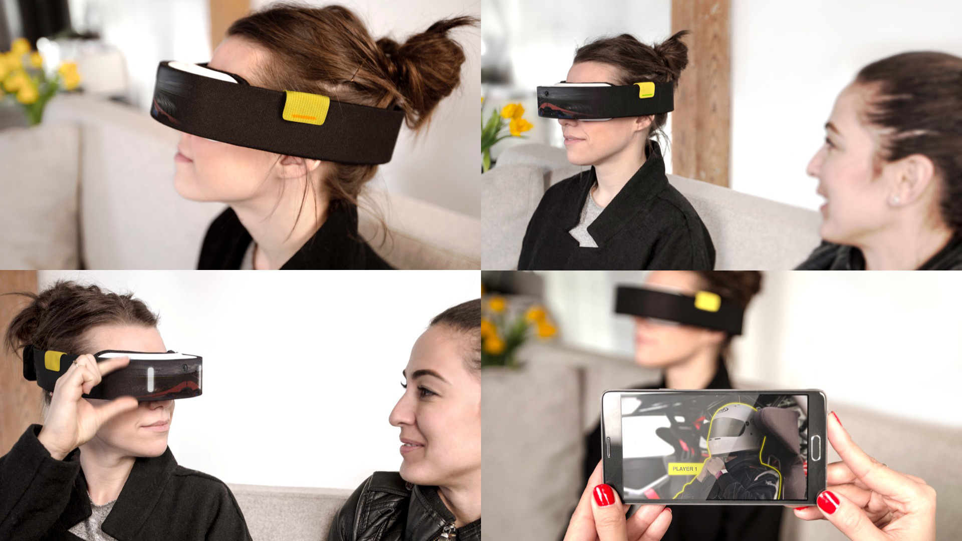
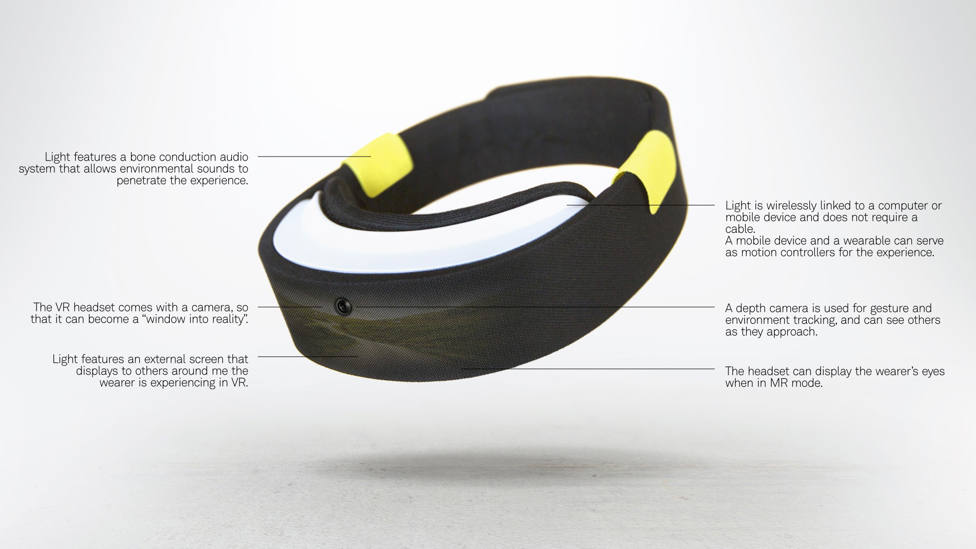
Light: In the moment, with you
We imagined Light as a VR headset for families or groups of friends who want to dabble in virtual reality but above all want to experience it together.
Simple, shareable and transparent,
It allows the user to stay connected not only to the virtual reality but to her environment and the people around her. A front facing camera allows the user to “see” what is going on around her, while a shareable mode gives them a chance to show others the content they are experiencing. Light connects wirelessly to other devices, letting others share the experience on a phone or a larger screen. Sound is transmitted through adjustable bone conduction audio system that allows the transmission of ambient sound. Ease of interactions is key for this concept– from putting on the lightweight device, to switching modes – everything is designed with the social user in mind.
Inspiration in the gray area of VR
No technology is inherently good or bad. VR has been called the “church of our imagination” by some and “virtual insanity” by others. Whether or not it becomes more than an addictive trap that insulates us from each other is within our control. And while I doubt I will ever dispel my grandma’s fear of tuning out the real world, it is my duty as a grandson, a father and a designer to try. To dive deeper into our process and the ideas we explored, or to find which headset is right for you, check out the VR Demystified project on 10,oooft.
Designing an open science solution for curing HIV/AIDS
Design
Designing for open science
Half of the 78 million people who have been infected with HIV since its identification in the 1980s have died, making it one of the most merciless epidemics in history. Today, more than 1 in 200 people is infected, with two million new infections recorded each year. While medical advances have made HIV easier to manage, researchers agree that an HIV vaccine is the most likely, and perhaps the only way by which the AIDS pandemic can be stopped.
In the face of all this, the Statistical Center for HIV/AIDS Research & Prevention (SCHARP) is on a mission to help HIV and other vaccine researchers around the world collaborate through data. SCHARP partnered with Artefact and LabKey Software to help define the objective, design a solution, and build the DataSpace, a web tool to empower vaccine investigators to explore data across HIV studies, generate new hypotheses, and accelerate the path to discovery.
[SCHARP DataSpace] is giving me the freedom to play with the data. It’s filling a niche that is totally empty right now.”
HIV/AIDS Researcher
A platform for an empowered, aware, collaborative community
HIV has many strains, mutates quickly, infects the very cells meant to fight it, and exposes very little of itself to attack. Researchers have conducted hundreds of HIV vaccine studies over the years, each setting out to explore a specific hypothesis about how it works or how we might fight it. Hidden within and across these studies are other important insights that were not part of the analysis plan. They remain undiscovered because the data can be incomplete, inaccessible, and difficult to stitch together. Researchers have to wait years before they can access their colleagues’ results in published research papers. More importantly, the actual data that produced the papers is often unavailable, relegated to a huge data graveyard where potential clues to vaccine stay buried.
In light of this, the Global HIV Vaccine Enterprise, the group of top HIV experts and funders, called for “a dramatic shift in the culture and practice of sharing research data.” Their top priority? Creating “databases for sharing trial data globally and an insistence on pursuing diverse hypotheses.”
The DataSpace brings researchers information that is easy to access, filter, explore, interpret, and export for further analysis. By using DataSpace, they can identify gaps in current research, review and learn about past work that can help them secure grants, and test new ideas to see if they are worth further exploration.
A new way of thinking
The purpose of the DataSpace is to make data more open and broadly available, changing the way researchers think about and share it. In order to design a solution that researchers would embrace, we needed understand how they work. We went through several key immersive steps to understand the science of HIV vaccine research and the culture of the community.
Data organization: From spreadsheets to subjects
Our most critical design choice came down to figuring out how to organize the data in the system. Previously, researchers needed to know their specific question ahead of time to align the data and make a valid combination (if they had access to the data at all). But after talking with researchers we flipped the model on its head: what if we pre-combined all the data? Doing so takes a lot of upfront work but enables users to pose any number of questions that lead them to exploring new directions. The DataSpace gives researchers the opportunity to uncover connections they had not anticipated.
Trusted collaboration
The original idea for the DataSpace was to support a more open style of online collaboration with social posting, the ability to annotate conclusions, write comments and contribute to discussions. But researchers firmly rejected that idea. Their reputations rest on rigorous processes and peer reviews. Spontaneous comments or misinterpretation of data can cause irreparable career damage. At the same time, they value new collaborations and novel interpretations of their results. So, how can we facilitate collaboration and sharing, while minimizing the valid concerns of researchers?
In the DataSpace, users can see who contributed data to a dataset, alongside study details and contact information. This makes it easy for researchers to credit the original data contributors or clarify how they are interpreting the data. Instead of forcing digital collaboration through the DataSpace, our goal is to spark new conversations and collaboration between labs in the ‘real world’ of conferences, email, phone calls, and partnerships.
The power of data visualization
For the DataSpace to be truly useful, we had to design analysis tools that provide value across a large range of experiments and data sources. Unlike specialty tools targeting results from only one test, we developed a core set of visualizations that show data from any test. For instance, the plot visualization lets users take one to three variables from different sources and find patterns in post-vaccine immune response across tests, studies, vaccine types, and more. Unlike generic visualization platforms, the DataSpace is easy to jump into, has many unique visual analytics features made just for vaccine science, and empowers users to see and interact with data based on multiple relevant criteria.
A new first step for any researcher
The power of science is the ability to build on previous discoveries. Yet some researchers might not be aware of existing work or lack details on how it was performed. To address that need, we created the “Learn About…” section. It serves as an encyclopedia of HIV vaccine studies and immune assays, and a first step before embarking on a new research study.
Make a virtual cohort
Cohorts are groups of subjects with something in common – usually they are in the same study and treatment. But in the DataSpace, users can define a cohort across studies using any subject characteristic or threshold of experimental performance they choose. Save it for later and explore any number of ideas with it.
Discover new relationships through a multidimensional view of data
The plot has room for three variables, with special views for comparing groups, comparing experiments, and tracking immune response over time. While it was meant to reveal interesting ideas about immune response, it’s also useful to quickly understand the characteristics of the available data.
A promising first step to overcoming HIV
The long-term vision for the DataSpace is to become part of the research pipeline in vaccine trials, adding new data from studies as they are completed. Researchers are already using it to answer basic factual questions, perform quick, low-cost tests of an idea, make comparisons across diverse measures, and start to deepen collaboration with one another. The DataSpace is available to hundreds of researchers worldwide who are on the frontline of fighting this devastating disease. Our goal is to continue to grow the DataSpace with rich data from multiple networks, studies and researchers, helping direct research towards promising new hypotheses and becoming a case study for the promise of open science along the way.
Understanding South African youth mobile phone use
Strategy
While smartphone usage is set to explode all over Africa, the reality is that most phones used today are still feature phones – the kind that let users access the internet and play and store music, but do not let them download apps from an app store, and lack the overall advanced functionality of a smartphone.
The Microsoft Emerging Markets team tapped Artefact to investigate how to extend the value of feature phones by understanding the needs and desires of low-income South Africans and mapping them to scenarios and opportunity areas that could narrow their technology gap.
Understanding through immersion
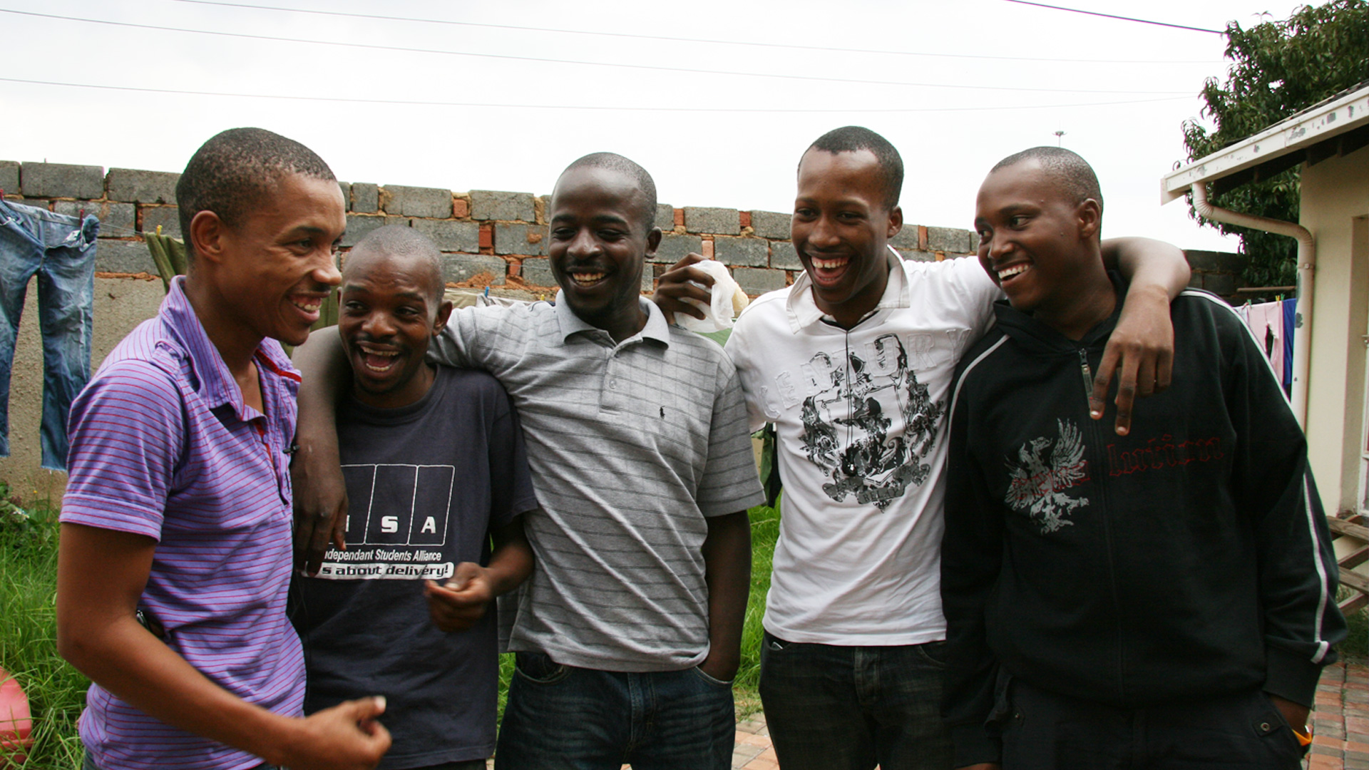
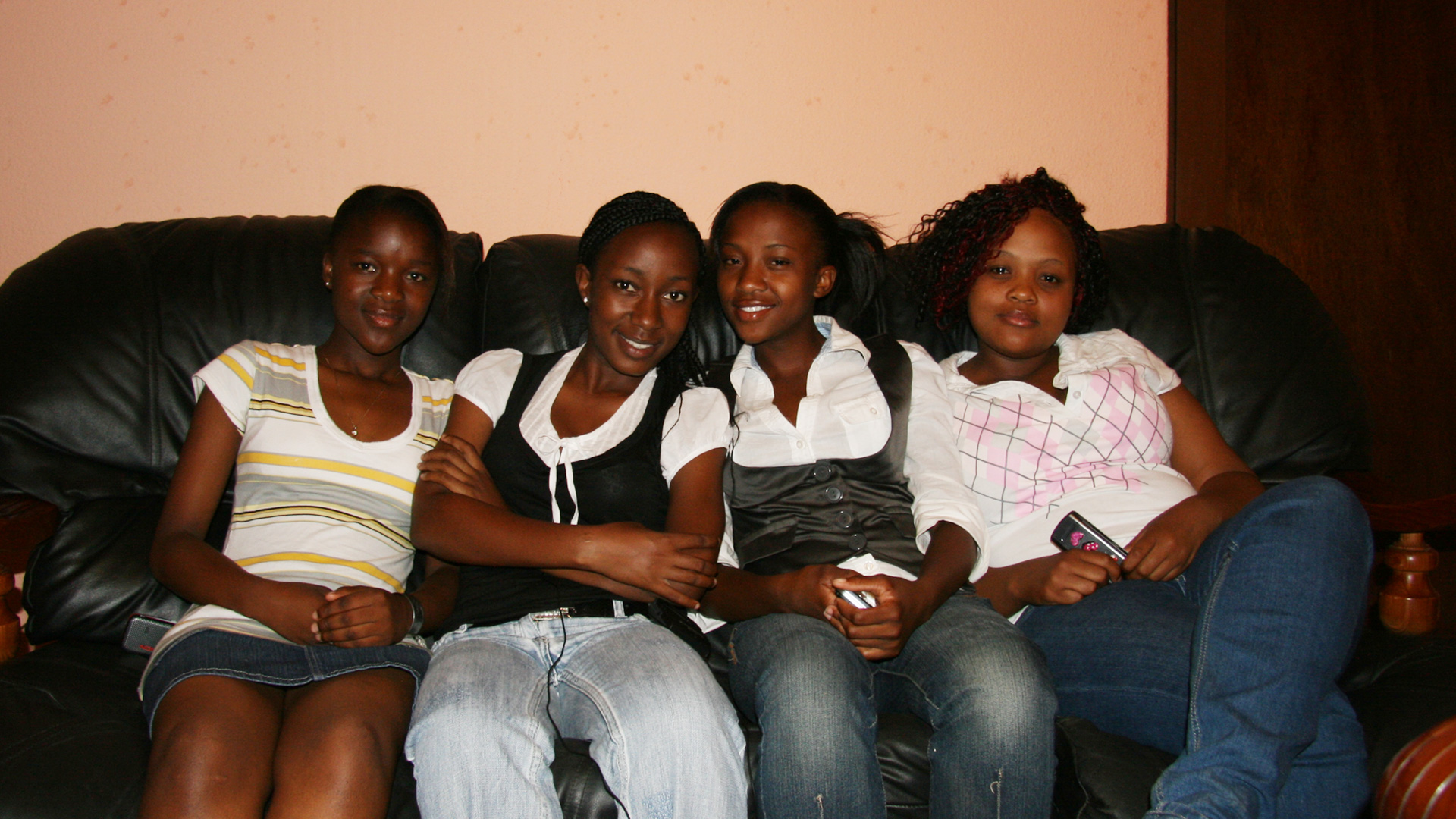
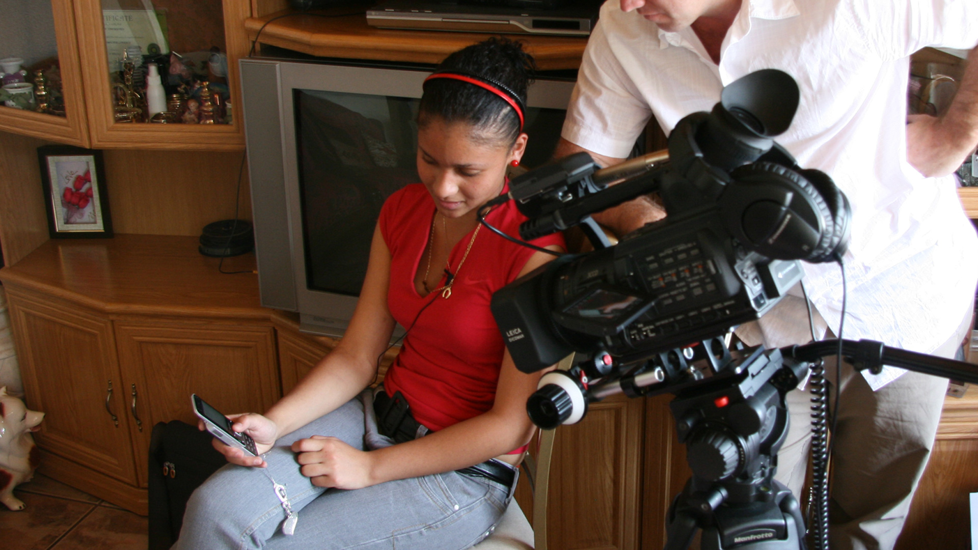
While South Africa’s population is quite young, their unique needs as consumers are often overlooked. Our goal was to research the daily behaviors, motivations and group dynamics of South Africa’s urban youth in an effort to uncover key design opportunities. For weeks, we immersed ourselves in several teenagers’ lives. From observing everyday life in their townships to interactions with each other and their families, we developed an understanding of the role of their phones in their lives.
Using research techniques that involved uncovering group dynamics between teens and their friends, we were also able to identify genuine interactions between the teens and their phones. Through a series of design thinking exercises, we established several design principles and business recommendations for a new mobile platform experience that was unique to this market.
Prioritizing social experiences
We discovered most of the teens used their phones for socializing: messaging friends, visiting chat rooms, listening to and discussing music, and viewing, taking and sharing photos with each other. Yet, few of the existing platforms allowed feature phones to do many of these activities easily or affordably, due to their limited memory and processing power. It became clear through research discoveries like this that the Microsoft feature phone platform needed to prioritize social behaviors, with features like low-cost messaging and chat room conversations, as well as file sharing for music and photos. To create a truly shared social experience, we also recommended that the platform support multitasking. This way, teens could listen to music while chatting with their friends, exchanging photos and just being teenagers.
Providing support through celebrity
On the verge of adulthood, the youths in our research were in a period of transition in their lives, grappling with new situations and encountering complex topics like love, sex, and identity. Many of them were not comfortable broaching these topics with their families due to the expected generation gap, but also because of a unique cultural gap that made these topics taboo. Their parents had often grown up in rural villages with traditional values and had moved to urban areas, drawn by their higher economic potential post-apartheid.
Most of the teenagers we spoke with were the first generation of their families to have grown up in an urban environment and needed help sorting through their growing pains, but couldn’t speak with their families. Instead, they sought advice in chat rooms, building relationships with celebrities and influencers. This presented a unique opportunity for Microsoft. Through celebrity sponsorships, the company could have a positive impact and raise awareness about the important issues teens deal with, such as sexual activity and violence, racial tensions, and the pressures to partake in illegal activities, while attracting and retaining teens to the Microsoft platform.
Increasing safety through design
High crime rates plague youth in the townships and mobile phone theft and muggings are, unfortunately, a common experience. As a result, teens were wary of using their phones on their daily commutes, which were often upwards of three hours long. Yet, their desire to speak with their friends and listen to music often resulted in risky behaviors of concealment, like trying to use their phones while hiding them inside a backpack. Artefact recommended that the Microsoft platform allowed for an ‘out of sight’ usage experience. Features such as listen-to-text and voice-enabled phone commands were key considerations for this experience.
Using research to set emerging market strategy
Artefact’s and Microsoft’s partnership set the foundation for defining the platform’s user experience, and also prioritized an often-overlooked segment of the mobile user population in South Africa. The human-centered design techniques we used uncovered opportunities that continue to influence the Microsoft emerging economy strategy today, developing high-function phones with limited technical storage and capabilities. There are few companies who have dedicated as many resources as Microsoft to servicing emerging markets with meaningful solutions designed for their specific social, cultural and economic contexts.
PATH is an international nonprofit organization that transforms global health through innovation. PATH takes an entrepreneurial approach to developing and delivering high-impact, low-cost solutions, from lifesaving vaccines, drugs, diagnostics, and devices to collaborative programs with communities. Through its work in more than 70 countries, PATH and its partners empower people to achieve their full potential.
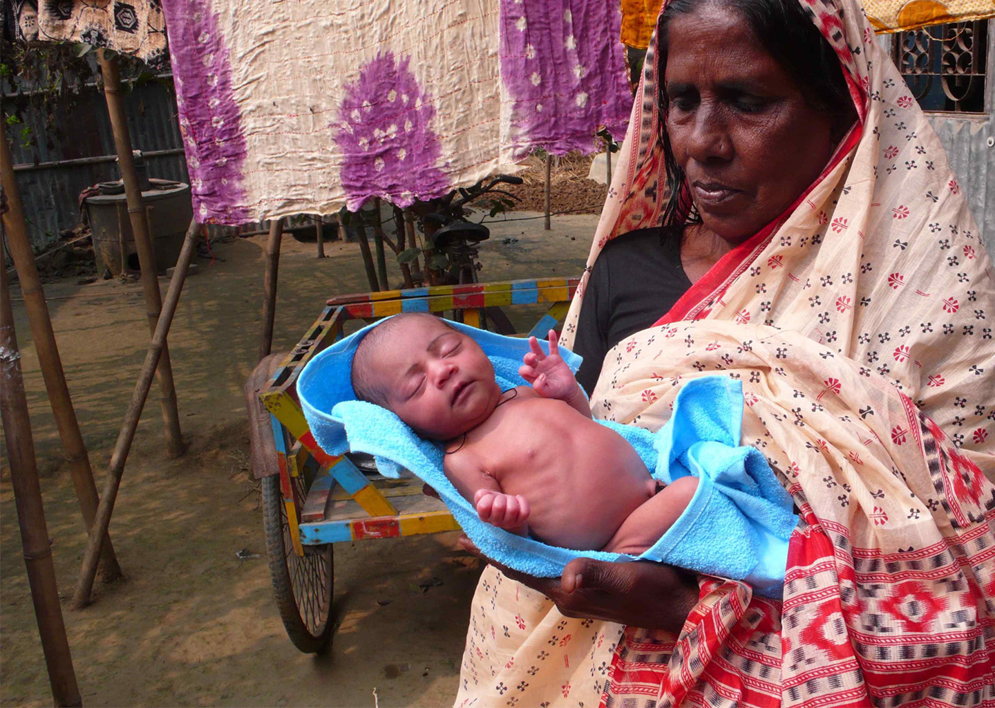
PATH and Artefact partnered together to investigate and explore solutions to one of the most serious yet preventable health challenges in the developing world: maternal morbidity and mortality. We set out to identify the factors that influence how and when new mothers seek care in these rural areas. Our goal was to design diagnostic product concepts that would reduce the life-threatening infections that occur during pregnancy and labor.
“One of the most successful experiences in our project on maternal and perinatal infections was the collaboration with Artefact for the primary research in-country. Their use of techniques such as storyboards for use scenarios and hypothetic product concepts provided us with richer, more complete data.”
Dr. Sadaf Khan
Senior Newborn, Maternal, and Child Health Specialist, PATH
Grounding care in a user-centered perspective
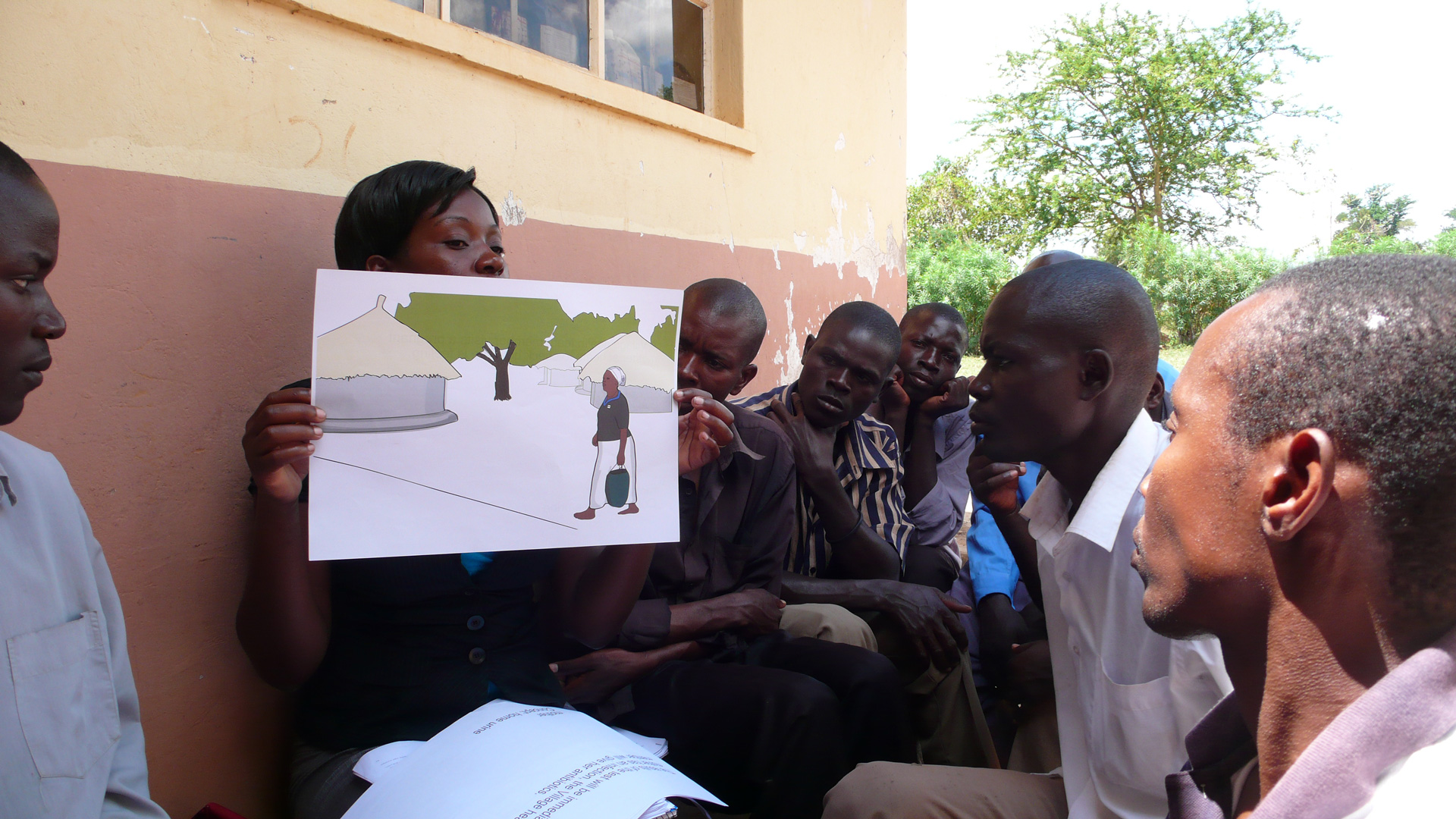
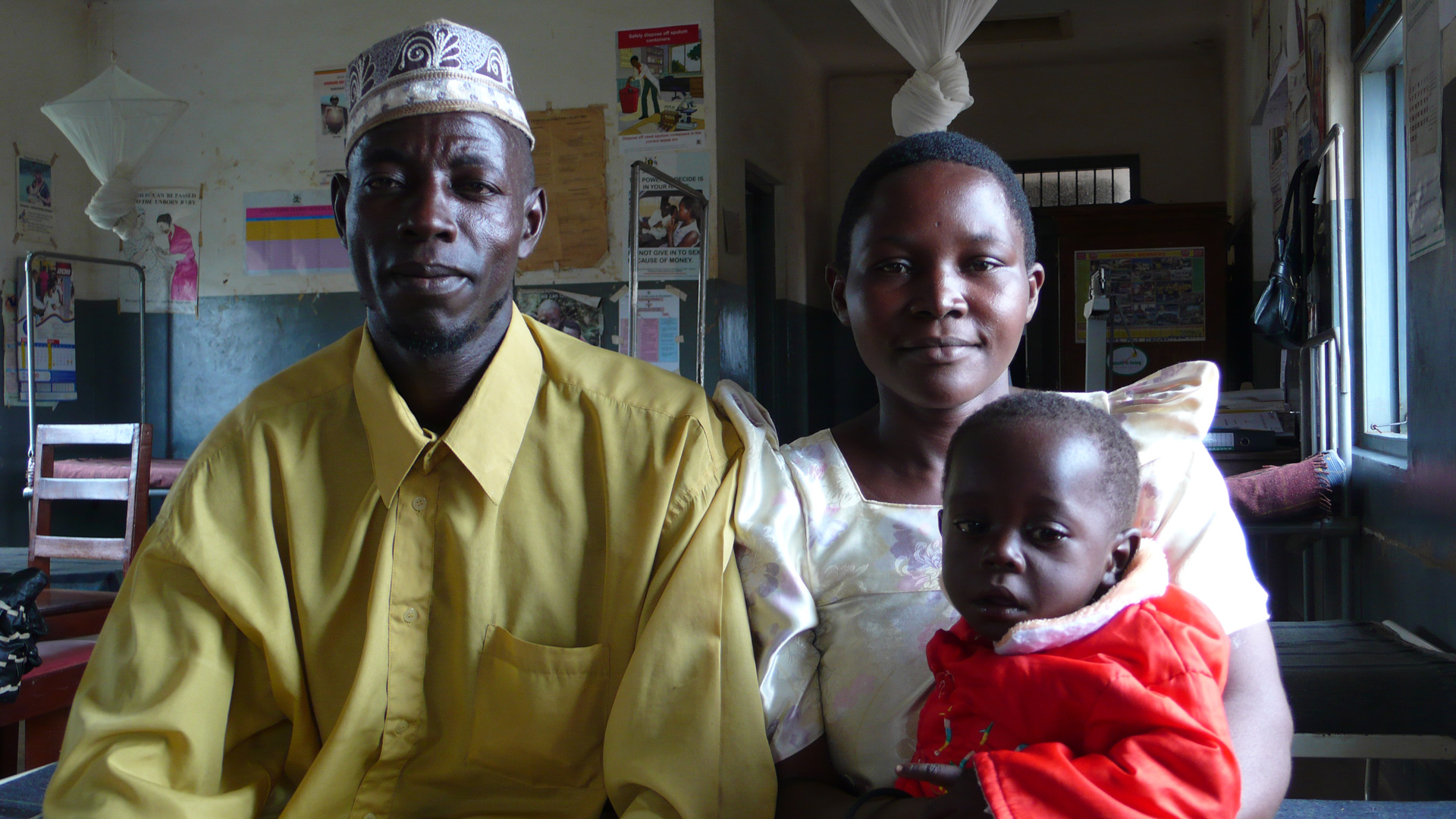
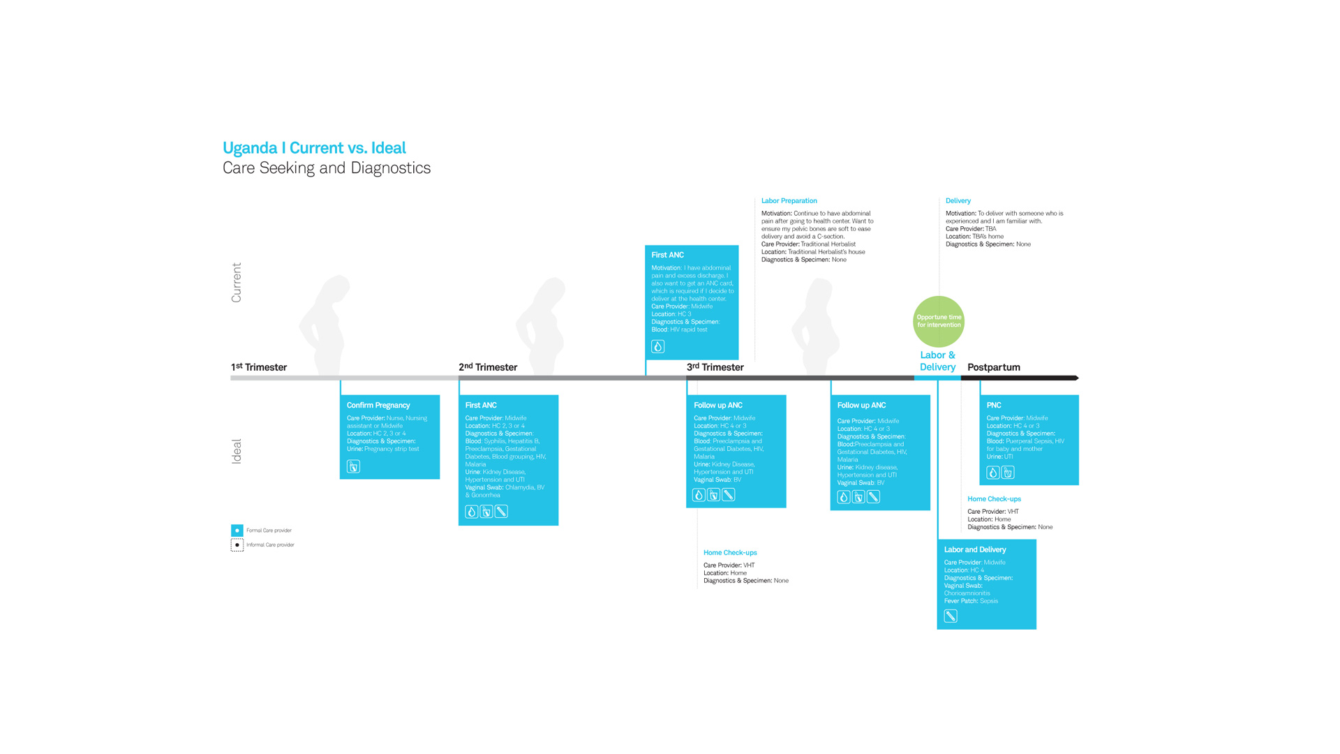
According to the World Health Organization, in 2010, 287,000 women died during pregnancy and after childbirth. The issue is most severe in remote rural areas of developing countries, where information access, cultural beliefs, and environmental conditions serve as barriers to receiving proper care. One of the main causes is untreated, yet often easily preventable: infections. During our partnership with PATH, we challenged stakeholders to rethink how pregnant women and the caregivers who influence them, could detect early signs of infections and subsequently seek treatment. Our approach was grounded in a user-centered perspective and began with ethnographic field research in Bangladesh and Uganda. We aimed to deeply understand the environments, social systems, and cultures that impact care-seeking behavior and ultimately, life-threatening infections.
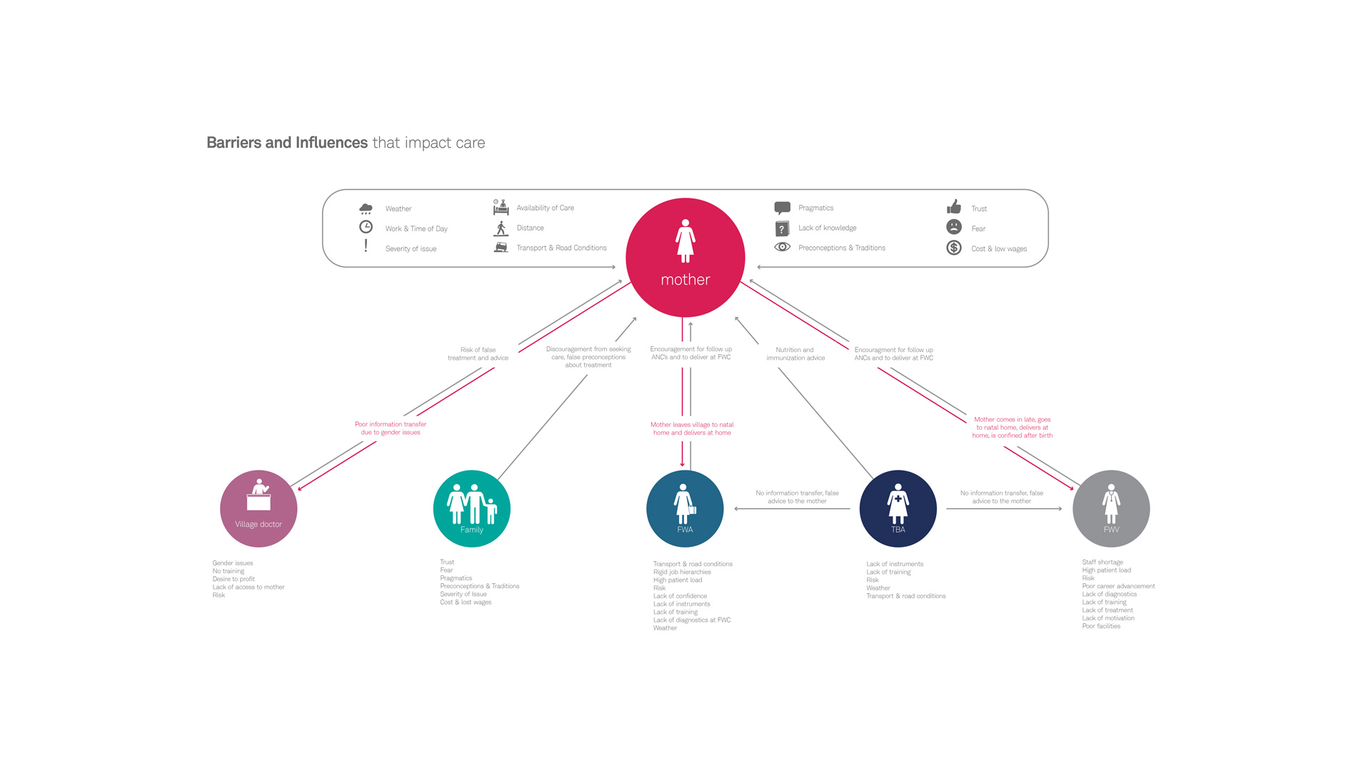
Recognizing formal and informal influences on care
At the outset, we recognized that women receive care and advice from a wide variety of places during pregnancy. Our goal was to identify these information sources and understand which are influential, which act as barriers, and which come from formal (i.e., trained) vs. informal (i.e., untrained) health care providers. One key discovery that impacted our product design criteria aligned around providing a strong sense of authority. Pregnant women’s primary points of care are family members, traditional birth attendants who are largely untrained, and formal care providers who have approximately 2 days to 1 week of training.
In addition to this, pregnant women are seldom “in-charge” of their own health-related decision-making. These insights meant it was imperative that the diagnostic device provided authoritative and unambiguous evidence to women, their care providers and family members to seek treatment (see infographic below). It is only with this type of information that those involved would be willing to reconsider deeply ingrained cultural beliefs or take on overcoming barriers, such as treacherous road conditions, to seek formal care.
Finding the opportune time for intervention
No matter how perfectly designed the diagnostic tool was, we realized that if it wasn’t disseminated in a culturally acceptable way, widespread adoption would not follow. Through immersive research, we identified several factors that keep women from giving birth in clinics or hospitals, thus increasing the risk of infection for themselves or their babies. One of these cultural factors is the fear of “the evil eye” (a curse) that might be placed on a vulnerable newborn.
Fearing this, women deliver babies in their homes, or in the homes of traditional birth attendants. The often unsanitary conditions of childbirth and the low visibility in the environment, as well as the lack of training of caregivers, mean that labor can be extremely dangerous. We had to accept this strong bias towards giving birth at home and reframe this risky infection period in a way that would allow us to introduce the diagnostic tool, yet not threaten traditional beliefs.
Understanding acceptability within cultural context
We recognized that we could have the most impact by introducing the diagnostic during labor (see infographic above) and set out to ascertain the ideal form factor of the diagnostic. Collecting a specimen such as blood or urine might be most accurate, but would it be acceptable, and therefore, practiced? To learn about acceptability, we conducted scenario-based acceptability research with pregnant women, their mothers-in-law, husbands, and other people who influenced how they sought and received care.
We discovered that women were not comfortable self-administering diagnostics that require any type of specimen collection. They also did not trust birth attendants, family, and community members to collect specimens or to interpret test results. Not only did they worry about testing accuracy, but they were apprehensive of the possibility that gossip in the close-knit community would strip them of confidentiality.
From insights to solutions
After months of discovery-design-iteration cycles, we formulated product design criteria that would serve to inform the development of the infection diagnostic. Criteria included specifics about who should deliver the diagnostic and how it should be administered, given the location of use. For example, if formal providers have the opportunity to provide care, the diagnostic should provide on-the-spot diagnosis to help patients avoid additional trips and also be bundled with the frequently used “maama kits” women are familiar with. If the diagnostic is used at home with an informal provider, the diagnostic must provide authoritative evidence to seek further treatment, be administrable by patients themselves, and not be invasive.
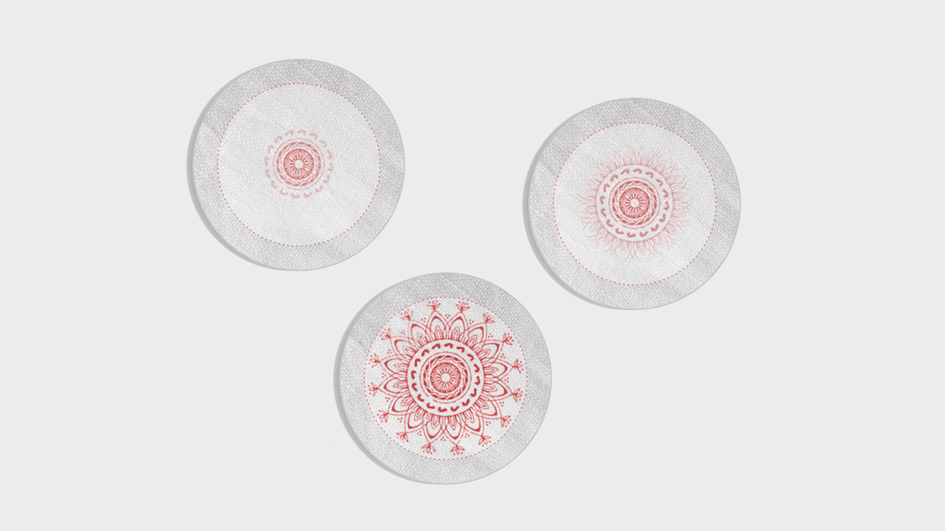
We also explored several design concepts that met these design criteria. One concept is a fever patch that women would wear immediately after labor. The patch can detect a continuous fever over a 25-hour period, which is a signal of infection at such a vulnerable time. As women experience intermittent fevers during labor, the seriousness of a continuous fever is commonly ignored. The fever patch is a non-invasive measure that shows when the wearer has a fever by filling with a red pattern that spreads over the patch. It gives an authoritative, yet unambiguous signal to women and their untrained caregivers that immediate help should be sought.
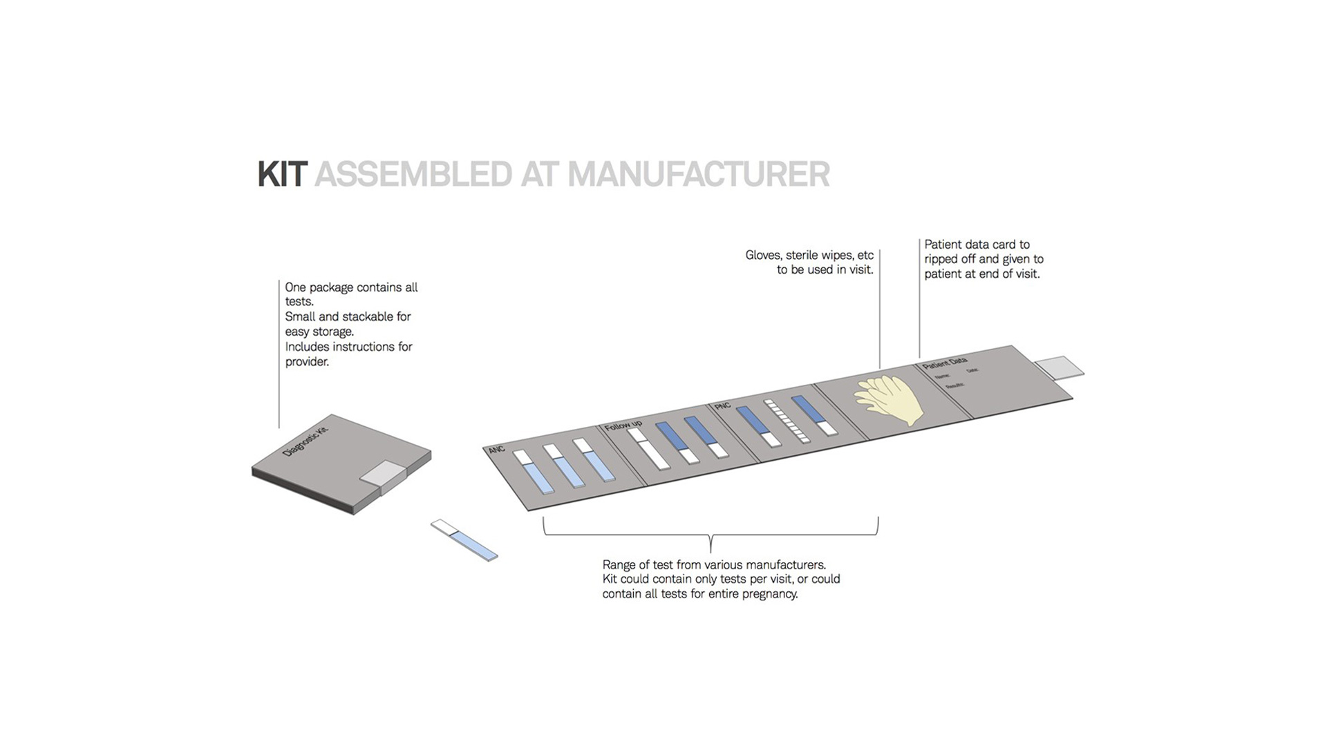
We also explored two kinds of kits, the first is a pregnancy care kit, assembled at the manufacturer, that includes diagnostics for all points of care: during the first antenatal care visit, the follow-up, and the post-natal care visit. The kit can be customized based on regional factors. For example, an HIV diagnostic would be included in Uganda, but not Bangladesh. The kit also could give providers guidance for how to administer diagnostics, and also, as patients could see which diagnostics they should be receiving, they could hold providers accountable to administer them.
The second kit is a diagnostic kit (pictured below) that would be assembled by a provider within a clinic. We found challenges in trying to keep current records, so the diagnostic kit helps keep patient information and test results together. The kit also incorporates the current method of test distribution and procurement that occurs in clinical settings, and can be customized based on what is in stock at the clinic.
Unraveling global health with human-centered design
Global health is an extremely complex area to improve upon because of several factors, namely the cultural nuances affecting daily decisions involved in seeking care. In order to improve upon these conditions despite the cultural barriers, it’s important that we apply a multi-disciplinary approach to identify opportunities for change. It’s crucial that the human perspective is at the center of these ideas. It was only by using this as our primary lens that we were able to uncover what stood in the way of care for mothers and provide solutions that are useful and accessible within the cultures where they exist. At Artefact, we are particularly passionate about this topic and could not be happier to partner with PATH on using human-centered design to tackle the complex global health issues of our world.
Helping breast cancer patients understand and discuss their monitoring options
Imagine this: You just went through the emotional and physical hell of breast cancer treatment for months – maybe even longer. You suffered through chemo and lost your hair, changed your schedule and diet, did research, struggled to cope with your emotions and other people’s too, and possibly went into debt.
Like the three million women who survived breast cancer before you, you’re all too familiar with difficult health care choices. In the face of a high risk of recurrence, over the next five years you’re willing to go through a lot to make sure that if the cancer returns, you detect it early. Recently, more women and doctors are adding MRIs to the usual mammography as part of post-treatment monitoring, but should you? Extra tests can be inconvenient, expensive, and create anguish when false detections take time and work to resolve. You may even end up treating something that never would have caused a problem for you. You’re emotionally and physically exhausted and there’s little information available to help you make this decision.
This is the challenge Group Health Research Institute (GHRI) set out to address with their SIMBA study (Surveillance Imaging Modalities for Breast Cancer Assessment). Conducted between 2013 and 2016, the study goals were to conduct the largest-ever analysis of the effectiveness of mammography and breast MRI, then use the data to empower patients to select the right imaging solution. They gathered perspectives of patients and doctors, then began the analysis with 36,000 breast cancer exams. Early in 2016 they approached Artefact to design a decision aid that could help breast cancer patients understand and discuss their monitoring options.
“Human-centered design turned the insights from our research into a tool that can help breast cancer patients feel confident and comfortable with their decisions in time of high anxiety. SIMBA is a great example of what patient research and human-centered design can do together.”
Karen Wernli
Group Health Research Institute
The SIMBA Decision Aid: minimizing surveillance anxiety through clarity and confidence
The SIMBA decision aid is designed for stage 0-III breast cancer patients who have not had double mastectomies, to help them learn the facts about mammograms and breast MRIs, receive personalized risks and benefit information based on imaging results from thousands of other women, and understand which option is more aligned with the things they care about. Today, there is no other place for women to get comprehensive information on this issue while reflecting on personal impact.
“This information has prompted me to talk to my oncologist about my breast density and if that would indicate an MRI might be warranted.”
Breast cancer patient
Artefact interview
Helping women develop an informed preference
The app walks women through what it’s like to experience each type of imaging, along with stories from women who have been through this decision, and provides a comparison of the various risks and benefits. Women are encouraged to reflect on what matters most to them (e.g., physical discomfort, health risks, cost), and note questions and concerns they’d like to share with their care team.
Personalization
Patients told us that personalization made the decision aid more valuable and interesting than any other resource. The personal report is tailored to each user’s unique medical history, and powered by GHRI’s data analysis. Each woman receives her own numerical, text, and pictograph descriptions of how often cancer will be correctly and incorrectly detected or missed with each type of imaging. The report highlights factors that are personally important, as well as the option she currently favors.
Value reflection
As a woman goes through the decision aid, she is prompted with questions to capture her values. Prompts ask for her current stance, then the factors she finds most important (e.g., avoiding false detections, health risks of the procedure, cost, duration). We designed these prompts to encourage reflection on each topic and capture data that can be included in the personal report in order to guide discussions with family members and doctors.
Science-backed visualizations
We know that small design decisions – like the order in which information is presented or the type of visualization used – have the potential to unintentionally bias women toward one option over another. To reduce bias in our design, we consulted behavioral economics, cognitive psychology and human-computer interaction literature on factors known to influence decision-making and risk perception.
Accessible information
Communicating complex medical information to a wide audience can be especially challenging. Working with a plain language expert from GHRI, we carefully reviewed language we used to ensure that women would be able to easily understand the information regardless of their level of education or English proficiency. To improve readability, we organized the information by topic using a “card metaphor” and used large headers to help orient the patient in the tool.
An invaluable resource for shared decision-making
Rather than a tool for making a final decision, the SIMBA decision aid was designed to be part of a larger, shared decision-making process. Breast cancer patients can use the site to develop an informed preference, and then talk to their doctors and family members about which way they’re leaning. Features like mobile optimization, printing, and emailing ensure the personal report can easily be brought to the doctor’s office. The report highlights questions the patient has for her doctor, as well as her self-reported priorities, to help guide the conversation.
From health data and devices to insights and decisions
Strategy
Chronicle is our vision for how devices, data and decisions can come together in a real time, context-rich solution.
According to the Centers for Disease Control and Prevention, chronic conditions that can be controlled but not cured, like cancer, heart disease, and diabetes, are the leading cause of death and disability in the United States, accounting for 70% of all deaths. Treating people with chronic conditions accounts for 86% of the costs in our nation’s healthcare system.
But while the macro numbers are staggering, the real-world challenges to an individual who lives with one or multiple chronic conditions are even more impactful.
From daily management of symptoms and medications to constant worry about how new situations and environments might trigger a crisis, if you are one of the 50% of US adults who live with a chronic condition, your quality of life is constantly under threat.
So we asked ourselves – if more than 90 million healthcare and fitness devices shipped in 2015 alone, if people themselves embrace managing their wellbeing through the 165,000 health apps available today, and if patients are willing to share their data to improve health outcomes for themselves and others, shouldn’t there be a way for people with chronic conditions to see and use the experiences of others to create more positive outcomes for their health?
This is the premise of Chronicle, our concept for a cloud-based platform and smartphone app that integrates real-time environmental, device, biometric, and self-reported data from people with shared health factors. Chronicle helps people quickly gain meaningful insights and make more effective decisions regarding their chronic conditions using real-time, shared data.
“Artefact demonstrates how [big data] might be useful in immediate, day-to-day interventions.”
Mark Wilson
FastCo Design
Personalized, relevant, real-time insights in the right context
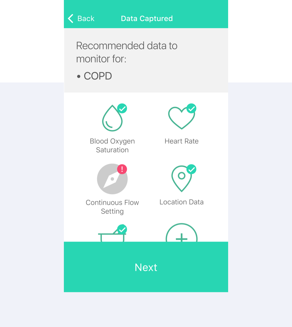
If you don’t live with a chronic condition, choices like which route to take as you walk to work, are often simple and unconscious ones. But for someone with chronic obstructive pulmonary disease (COPD), for example, it can be a critical decision that may end up costing her physical pain, time in the hospital, and unexpected medical bills. If they take a more scenic, but longer, more strenuous route, without taking into consideration their current state or environmental factors, they risk a significant health setback.
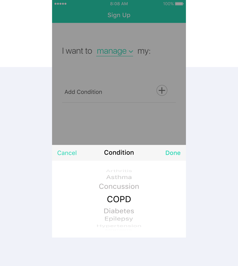
These are the people Chronicle is designed to help. The app prompts users to develop a personalized profile based on their conditions and symptoms as well as device and sensor availability. Chronicle analyzes and matches one patient profile and layered, real-time contextual factors, to that of others with similar attributes and in similar contexts. It then surfaces insights and alerts that help the person make smarter choices about everyday life. In the case of our COPD scenario, Chronicle can alert the patient that in similar situations, people with similar clinical profile, symptoms, and biometric measurements were able to safely complete a strenuous walk.
While the symptoms of chronic conditions vary, people seek to understand what their symptoms mean, want to discover what impacts how they feel, and need to know how their actions may make their daily lives better. The Chronicle core experience is designed with each of these goals in mind. Insights, considerations, and the ability to explore personal historic trends give people deeper understanding of how their symptoms change in different circumstances. A special high-sampling tracking mode can be activated when a patient decides she needs extra monitoring or guidance, for example when she decides to try a new activity. Proactive alerts and cross-device notifications keep her up to date on what she should know even when she is not focusing on the app.
“If gathering data from my suffering could save someone else from suffering, then for heaven’s sake, please do it.”
Woman living with MS
Support for multiple conditions
Unlike single-focus solutions, Chronicle allows patients to explore multiple conditions at once. This is especially important as chronic conditions often lead to other complications and comorbidities.
Open integration with connected devices
As more and more consumer and medical devices come online, they generate valuable data that can help create a detailed picture of one’s health. We envision Chronicle as an open platform that integrates data from many sources and creates a multidimensional understanding of chronic conditions.
Patient engagement through familiar tools
Chronicle is designed to support the emotional needs of people with chronic conditions. We designed the experience to feel more like communicating with a friend or a guardian and less like a medical device or doctor’s visit.
An app that is always on, a patient that is always in control
As we move to a world where patients are becoming more engaged and making more decisions about their care, it is important to empower them with control over the data they track. Unlike other health apps, which make assumptions about why the user has engaged with the app (and predisposes them to a certain experience tone and workflow), Chronicle allows patients to define the experience which will be most meaningful to them. Chronicle supports this need with an easily glanceable sensor screen and the ability to quickly turn sensors on / off for different views on how they are doing and how they can learn from the data of others like them. The system can learn how people prioritize symptom input and what insight cards are most useful, and then the system can make recommendations to other users on how their experience is best structured.
Vizable turns data into beautiful, interactive visualizations that can be shared right from an iPad.
These days, data is quite literally everywhere. Small business owners keep track of their sales and profit margins; the health nut may keep tabs on how many miles run or calories consumed; cities publish stats on growth voting and construction; plus so many more examples.
We are constantly logging data and filing it away, with minimal ways to see what it all means and understand how it impacts us. As more of this data is collected and made publicly available, the ability to visualize it is becoming increasingly important.
Tableau, the industry leader in visual analytics, is on a mission to help people see and understand their data. Recognizing that there is currently no good way to get a quick visual of spreadsheet data on a tablet, Tableau envisioned Vizable: a new application that turns data into beautiful, interactive visualizations that can be shared right from an iPad.
Tableau partnered with Artefact to bring that vision to life and bridge the gap between complexity and clarity. Together with Tableau, we focused on designing a user experience that helps people grow into asking deep questions that data can answer on their iPads.
Our goal was to give people engaging tools that encourage them to explore, while making sure the data remains the hero. From the moment the user opens the app, static spreadsheets become living visualizations that they can flip, move and sculpt, bringing the data to life. From the business owner and event planner, to the health fanatic or anyone with a tablet and some data, Vizable brings the power of data to your fingertips, no server or other expensive products required.
Vizable is a free application available now through the iPad app store here.
“Ultimately, Vizable wants to make deciphering data approachable, intuitive, even enjoyable.”
Meg Miller
FastCo Design
An experience of guided exploration
Vizable aims to help people create a better understanding of how to manipulate data. To help users grow into asking more insightful questions and using the powerful tool to its full potential, together with Tableau, we identified the key interactions to get them started and created a first run experience that teaches people enough to learn the rest by exploring on their own.
A new way of thinking with new interactions
Vizable’s dynamic, interactive experience puts it closer to a generative drawing tool than to a cumbersome spreadsheet. This new interaction model helps people quickly grasp not just actions, but a way of thinking. For instance, a slide-in menu makes powerful functionality like slicing filters easily available without forcing users to memorize all of the app’s gestures.
“The rise of big data has put considerable wind into the sails of visualization tools like Tableau, but it’s also put a new premium on simplicity and accessibility…Vizable [is] a free new iPad app that puts sophisticated analytics capabilities at users’ fingertips.”
Katherine Noyes
IDG
Data sculpting: The science of data and the art of design
Tableau’s unique animation engine can give people deeper insights into the connections between data. Together, we connected the animations to intuitive gestures that make the interactions and implications of data manipulation direct and tangible. Finding the right balance between transitions that are dynamic and engaging, yet precise and readable was key to developing a design that isn’t “dumbed down.”
Starting off on the right foot
We created several animated tutorials to give users an introduction into the subtle but powerful interactions housed in Vizable. From how to add and rearrange columns to changing fields and filtering, new users will instantly be able to see their data come to life.
Learn by doing
We worked with Tableau to introduce a filter menu in Viable to make key functions of the application available even when users have not yet learned the shortcut touch gesture to perform them. This gives users the chance to see and understand the power of the application right away, and learn more about shortcuts like swipe, pinch, and drag and drop over time.
See the full picture
Going full-screen allows users to push all the buttons, palettes, and tools out of the way, elevating Vizable’s core feature and functionality: data visualizations. Subtle UI features like this let users focus on the data, not on the interface.
Tableau’s Vizable comes at a time when the need to understand data is no longer only the job of the data analyst.
We can download all kinds of information from our finances and fitness to open civic data, but what does it mean? Vizable represents an opportunity to visualize that information, play with it, shape it and manipulate it with our fingers in a way that will help turn those endless spreadsheets into meaningful information.
Dialog helps people with epilepsy live their lives to the fullest.
At Artefact, we believe that design can play an important role in helping achieve better health outcomes. By aligning contexts to experiences, building deeper connections between patients and their caregivers, and surfacing clear paths to better decisions, we can improve the life and care of the more than 130 million Americans who live with a chronic condition.
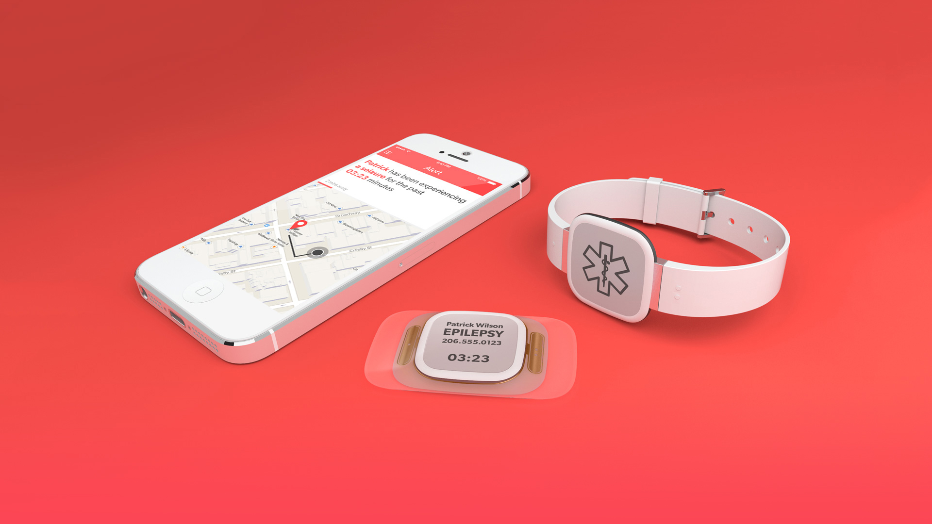
Dialog is a concept designed to help people with epilepsy gain a deeper understanding of their condition and make better decisions about their care. It gives them an easier way to manage triggers and thresholds while it empowers them to use assistance from family caregivers, first responders, and clinicians as needed.
Dialog consists of a wearable module that collects a range of meaningful data about the patient and her environment while a smartphone app provides the patient with insights into the factors that trigger events or lower thresholds.
The platform can connect to the person’s family and caregivers or even educate bystanders in cases of emergency. The easy, lightweight data input lets the patient log key information about her condition and subtle notifications help the patient respond better.
“I like the idea of a lot of smaller, simple device which is connected to you. This is about your health. It should not be lost in everyday social life on a phone.”
Jody R.
Person with epilepsy
How can we give people with epilepsy a sense of control?
In the U.S. alone, nearly 3 million people live with epilepsy. 50,000 die from epilepsy-related cause each year. It affects more people than multiple sclerosis, cerebral palsy, and Parkinson’s combined. Yet current solutions fail to address more than one aspect of the condition, or are so cumbersome to use that they become a constant reminder of the condition that defines the person’s life. Design thinking and new technologies like miniature biometric and environmental sensors, low energy draw displays, and flexible printed circuit boards allow us to build innovative solutions that make managing and living with complex conditions easier.
Dialog gives people a sense of control in all aspects of their life by helping them learn about their condition and answer the question of what causes seizures, as well as warning and preparing them for seizures before they happen. Dialog reminds the wearer to take their medications and helps them get more informed support from family caregivers and first responders while comprehensive biometric and environmental data also gives them the ability to better collaborate with their physicians.
“Designers often talk about doing good, but Artefact actually backs it up.”
Kyle Vanhemert
WIRED
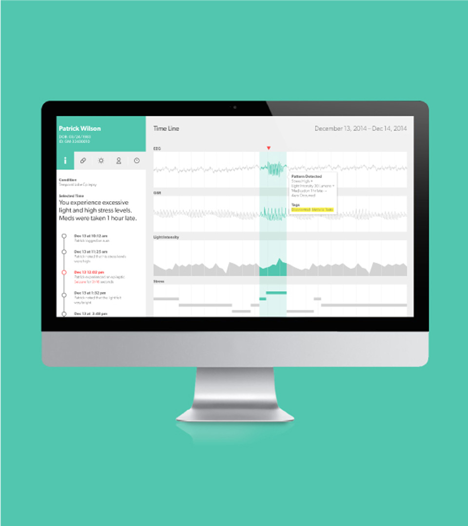
Detailed reporting that delivers insights from multi-dimensional data
The Dialog patient and family caregiver apps provide an easy way to interpret logs of observable symptoms and overlay that with data about relevant events and activities, providing rich insights over time of factors that may change thresholds or trigger events.
Better insights, better treatment
The Dialog patient and family caregiver apps provide an easy way to interpret logs of observable symptoms and overlay that with data about relevant events and activities, providing rich insights over time of factors that may change thresholds or trigger events.
Early warnings
Dialog communicates to the patient or family caregivers the potential onset of a seizure so that the patient can proactively get to a safe setting or take any preventative action possible to prepare for the seizure.
Flexible wearing styles
Different wearing styles, as a patch on the body or a bracelet on the wrist, allow the patient to determine where to place the device, depending on how discreet they want to be. This flexibility takes into account the person’s emotional needs and how she manages her condition.
Support when needed the most
In cases of emergency, a bystander app provides first responders with instructions on how to help the patient.
A glimpse of a possible reality
The components that can make a concept like Dialog possible are already being developed and tested. Creating innovative experiences that help people understand and manage their conditions better will empower them to live better lives – that’s creating a preferable health outcome by design.
A comprehensive solution for a complex condition
Dialog helps people with epilepsy achieve a deeper understanding and make better decisions about their condition. By considering all stages of epilepsy—pre-event, event, recovery, and living—we were able to design a solution that impacts the entire experience of living with epilepsy, not just one aspect of it. Dialog enables natural, frictionless time stamping of seizure onset and auras via a wearable module that is discreet and responds to intuitive gesture interactions. The platform allows the patient and family caregiver to report on observable symptoms, as well as other relevant activities and events. This is collected along with key biometric and environmental data. Over time, patients have access to a log of aggregate and multi-dimensional data that allows them to learn from past experiences and make decisions in the moment.
The wearable module can detect changes in threshold and can communicate to the patient or her caregivers, so that they can get to a safe setting or take preventative actions to prepare for the seizure. During a sustained seizure, the Dialog bystander app notifies nearby first responders and gives them instructions on how to help the person through the emergency. It also provides a direct line of communication to the family caregiver. The settings of the apps are configured by the patient, giving them flexibility and control over the extent to which they engage caregivers or bystanders. After a seizure, the Dialog patient app refers the patient to key contextual data to help reorient them and fill in any cognitive gaps from the event.
Finally, Dialog features a flexible form factor, giving the patient the opportunity to wear it in a way that fits with her lifestyle. The different gesture interactions, together with the flexible adhesive form factor, allow the patient to wear the device and easily input data even when placed under clothes. A bracelet form factor is for patients who would embrace the opportunity to feel special and proud. Dialog is a promise, but the technology components that could make it a reality are not far on the horizon. Most are currently being developed, prototyped, and tested.
Beyond epilepsy
According to the Center for Disease Control, chronic conditions are by far the leading cause of mortality in the world, representing 63% of all deaths. In the United States alone, 75% of adults aged 65 and older are living with a chronic condition such as heart disease, cancer, respiratory disease, and diabetes. Chronic disease accounts for $3 in every $4 of health spending in the U.S. The issue however is not just prevention, mortality, and cost. It is about an approach to care that allows people to live as freely as possible despite chronic conditions.
We decided to focus on epilepsy because we wanted to explore a solution that can improve the patient experience for one of the most complex, unpredictable, and misunderstood conditions. Ultimately, our approach to building deeper connections and driving better decisions in the context of the patients’ lives can be applied to multiple chronic illnesses.