USAFacts Data Viz
Making charts understandable through a scalable visual system.

Design + Tech + Impact
Informing the public with an engaging and accessible data viz system
The Challenge
How can a data visualization be recognizable and attributable to an organization even if its logo isn’t present? As part of a brand refresh initiative, USAFacts, a non-partisan, not-for-profit organization engaged Artefact to help create a comprehensive design system for it’s data visualization. USAFact’s mission is to make government data accessible and understandable to citizens to support an informed public, which means they make a lot of charts and graphs. Recognized in 2025 by Ads Fontes Media as one of the least politically biased and most reliable media sources, USAFacts’ visualization system needed to balance brand recognizability, as well as being easily understandable, accessible, and scalable across it’s media channels, while still being perceived as trustworthy and non-partisan.
The Outcome
USAFacts worked with Artefact to create a comprehensive design system for data visualization to produce consistent, clear visualizations across multiple teams, media channels, and levels of visualization complexity. The visualization system included a set of flexible guidelines considering all visualization layers, an accessible color system with usage recommendations, typographic hierarchy, label and annotation standards, and visual components across a broad range of visualization types for both static charts and interactive visualizations. As USAFacts continues to leverage the new visualization system across its website and the data it presents, its audience will benefit from easily accessible, visually stunning, and exceptionally clear charts and graphs.
A flexible system to scale for complexity and media
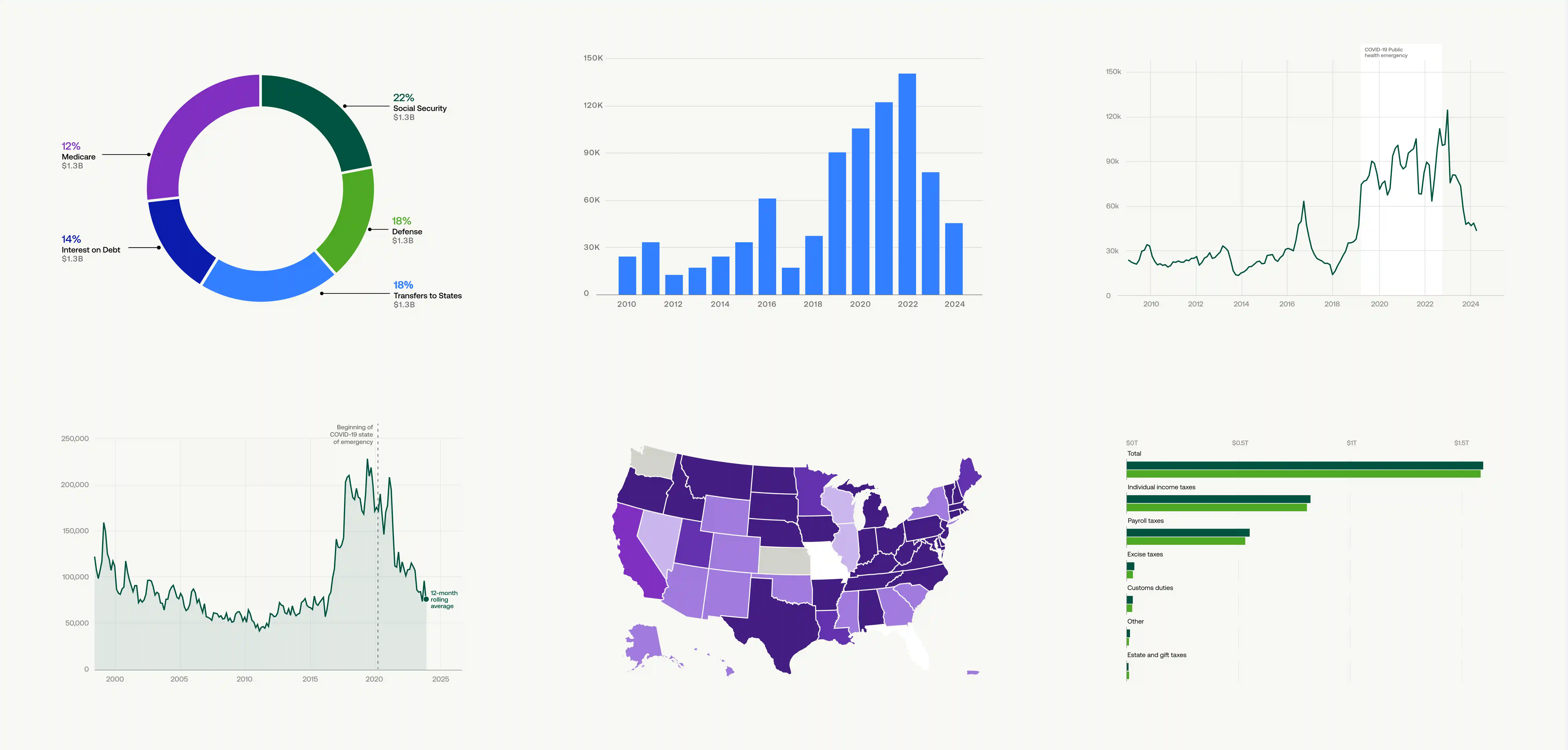
To reach the broadest audience possible, USAFacts presents data in a range of media channels. And, just like data itself, the visualizations it offers in those channels is both changing and complex. Through an initial audit and stakeholder facilitation, we understood the breadth and specificity of the most frequent and least typical data stories the system would need to tell. From understanding, we prioritized where to focus on the most used visualization types, as well as where flexibility needed to adapt across chart types in the future. The end guidelines not only have specifications at a system level for color, typography, labels, and annotations, but also for specific visualization types, how they scale across the complexity of data, and layouts for different media channels.
“Artefact’s data visualization refresh created a more cohesive, ownable look for USAFacts while also streamlining how charts are built. This was especially impactful for our Just the Facts video series, where standardized chart components reduced custom design work, sped up production timelines, and made it easier to scale the series without sacrificing clarity or quality.”

Creating recognizable visual elements to build brand caché over time
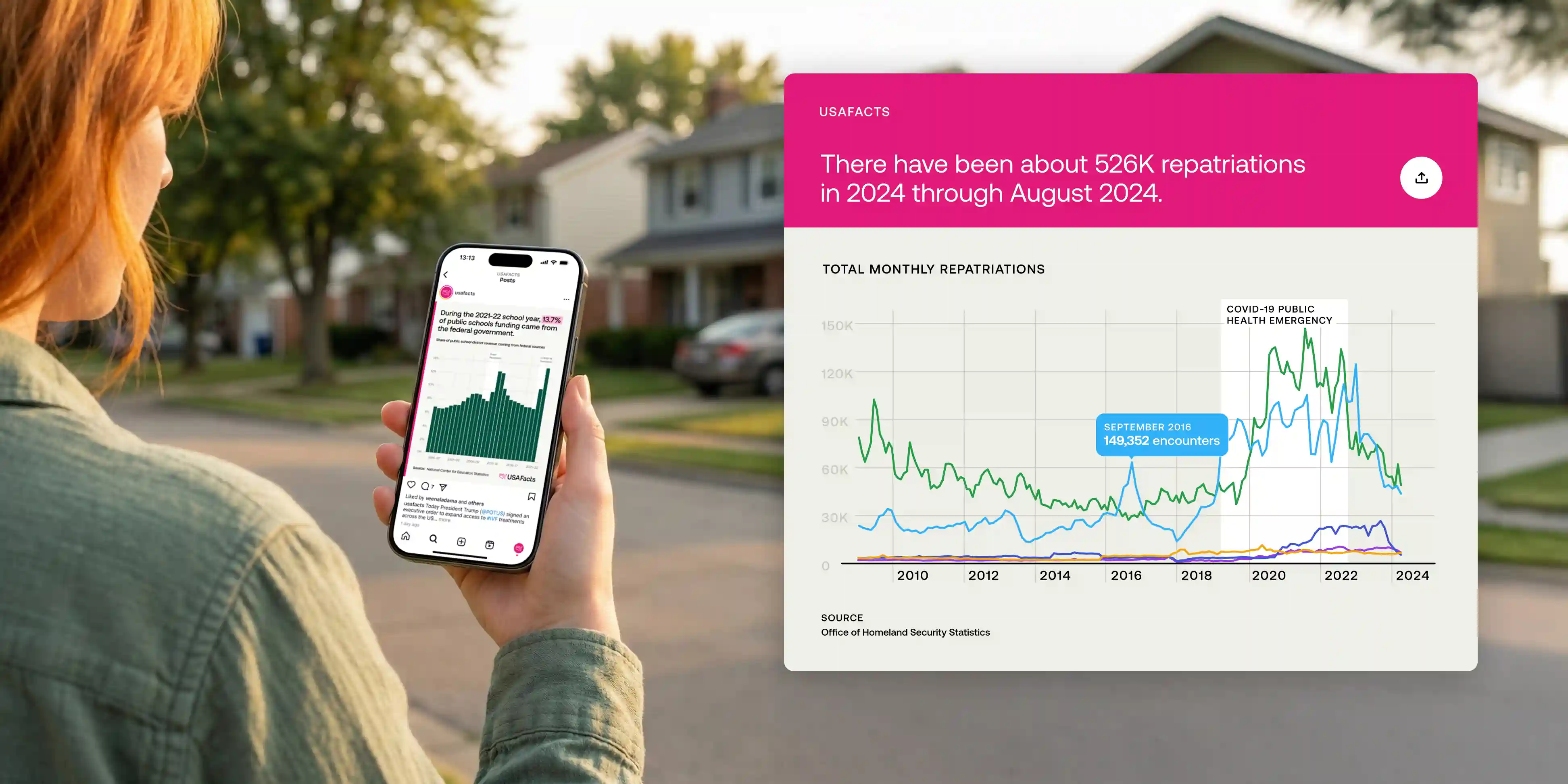
We worked collaboratively with USAFacts brand and marketing teams to experiment across the different data visualization layers such as color, annotation and labeling, and form language in chart types, and other graphical elements like titles and supporting graphical elements to develop visual markers that would make USAFacts’ visualizations stand out and gain recognizability over time, even if their logo wasn’t present or cropped out, while also supporting USAFacts’ mission of sharing politically neutral and trustworthy information. The solution? Visualizations with an off-white background, and a magenta rule—USAFacts’ primary brand color—running along the edge of the frame. This combined with a unique and accessible color palette for the data representation aims to build recognition over time.
More accessible visualizations starting at the system level
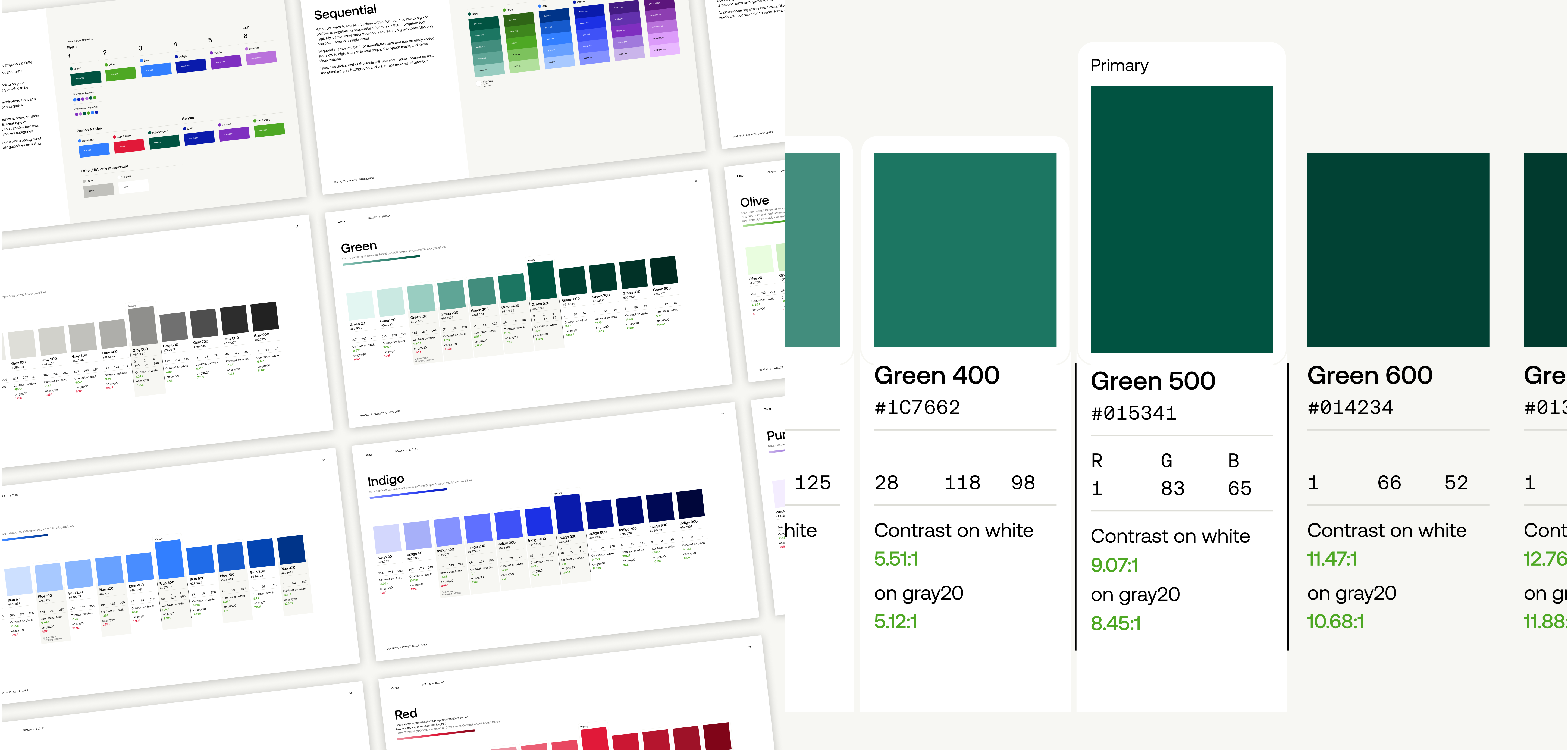
We worked diligently to develop a color system which met a minimum of an AA level of the Web Content Accessibility (WCAG) standards for all major surfaces and combinations. Most concerning was the value contrast in color combinations that were used in data visualizations as well as in label colors. Meeting these standards ensures those with lower vision as well as the most common forms of color vision deficiency will still be able to consume the visuals USAFacts produces. These accessibility considerations are built into the visualizations at a system level, making it easy for the USAFacts team to consistently and continually create more accessible visualizations.
“Artefact truly stood out for the range of ideas they explored, their patience and openness to feedback, and the care they brought to every detail while creating a design system that’s accessible, visually engaging, and on brand.”


Ensuring comprehension with target audiences
Before finalizing, we evaluated the system by testing with USAFacts’ target audience. We created a set of visualizations using real government data that followed the guidelines. The set included a range of visualization types USAFacts uses most commonly from bar and donut charts, to maps and small multiples. Each participant was shown the set of visualizations and used the “think aloud” protocol to walk us through their understanding of the data being displayed. This allowed us to understand the effectiveness of labeling, graphical representation, and overall comprehension. At the end of each interview we asked questions to gain an understanding of their overall general sentiment of the system. Did they see the data as trustworthy? Neutral? Understandable? What would they want to do with it next? From the evaluative testing, our team gained insights to make minor refinements in the system and guidelines, and our client gained additional confidence in the final direction.
A comprehensive guide to unify work across product and marketing teams.
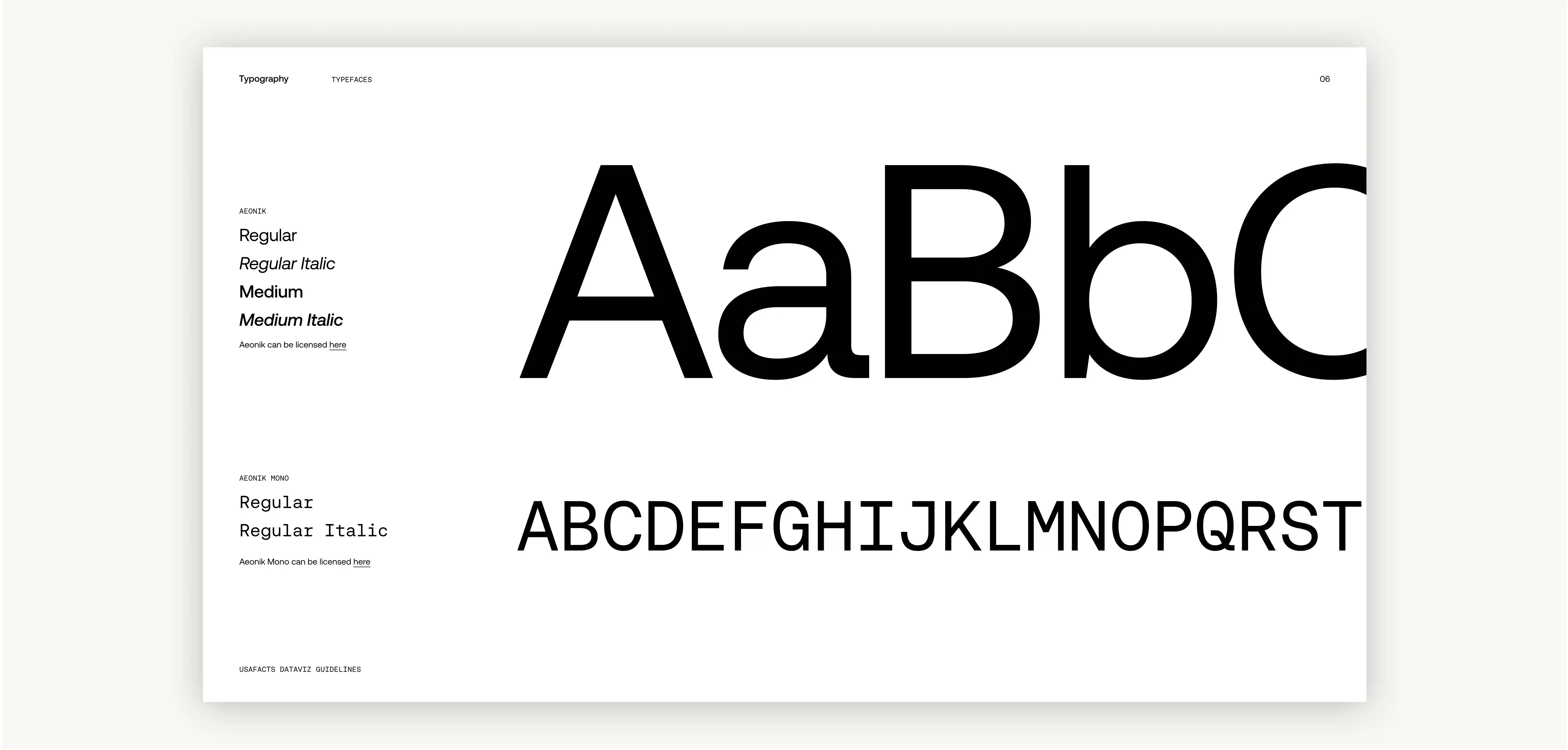
The final visualization system included an accessible color system with usage recommendations, typographic hierarchy, label and annotation standards, and visual components across a broad range of visualization types for both static charts and interactive visualizations.
Like many brands, as USAFacts grew over time, the reference documents their various teams used diverged to meet their respective toolsets, limitations of different media, and use cases for different consumption scenarios. The final guidelines worked to unify the guidelines with their evolving brand, and re-unify the look and feel between media channels. We wanted to make sure the guidelines would be realistic and implementable for their team. So, we worked inside and outside of the software platforms their product and marketing groups used to make charts for web, mobile, and social media to ensure the standards worked within their teams’ toolsets.
As USAFacts utilizes the new visualization system across constantly updated government data, unique visualization types, and a changing media landscape, the American public will benefit from easily accessible, visually stunning, and exceptionally clear charts and graphs.
What we delivered
+ Data visualization and information design
+ Design system
+ Evaluative research
+ Accessibility
Next project
The Tarot Cards of Tech