Vizable by Tableau
A mobile app for data exploration

Design
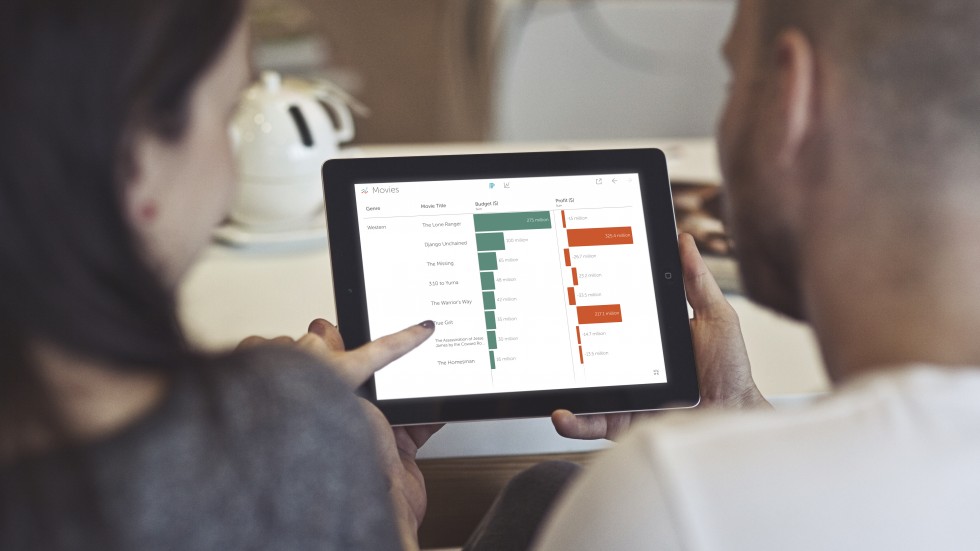
Vizable turns data into beautiful, interactive visualizations that can be shared right from an iPad.
These days, data is quite literally everywhere. Small business owners keep track of their sales and profit margins; the health nut may keep tabs on how many miles run or calories consumed; cities publish stats on growth voting and construction; plus so many more examples.
We are constantly logging data and filing it away, with minimal ways to see what it all means and understand how it impacts us. As more of this data is collected and made publicly available, the ability to visualize it is becoming increasingly important.
Tableau, the industry leader in visual analytics, is on a mission to help people see and understand their data. Recognizing that there is currently no good way to get a quick visual of spreadsheet data on a tablet, Tableau envisioned Vizable: a new application that turns data into beautiful, interactive visualizations that can be shared right from an iPad.
Tableau partnered with Artefact to bring that vision to life and bridge the gap between complexity and clarity. Together with Tableau, we focused on designing a user experience that helps people grow into asking deep questions that data can answer on their iPads.
Our goal was to give people engaging tools that encourage them to explore, while making sure the data remains the hero. From the moment the user opens the app, static spreadsheets become living visualizations that they can flip, move and sculpt, bringing the data to life. From the business owner and event planner, to the health fanatic or anyone with a tablet and some data, Vizable brings the power of data to your fingertips, no server or other expensive products required.
Vizable is a free application available now through the iPad app store here.
“Ultimately, Vizable wants to make deciphering data approachable, intuitive, even enjoyable.”
An experience of guided exploration
Vizable aims to help people create a better understanding of how to manipulate data. To help users grow into asking more insightful questions and using the powerful tool to its full potential, together with Tableau, we identified the key interactions to get them started and created a first run experience that teaches people enough to learn the rest by exploring on their own.
A new way of thinking with new interactions
Vizable’s dynamic, interactive experience puts it closer to a generative drawing tool than to a cumbersome spreadsheet. This new interaction model helps people quickly grasp not just actions, but a way of thinking. For instance, a slide-in menu makes powerful functionality like slicing filters easily available without forcing users to memorize all of the app’s gestures.
“The rise of big data has put considerable wind into the sails of visualization tools like Tableau, but it’s also put a new premium on simplicity and accessibility…Vizable [is] a free new iPad app that puts sophisticated analytics capabilities at users’ fingertips.”
Data sculpting:
The science of data and the art of design
Tableau’s unique animation engine can give people deeper insights into the connections between data. Together, we connected the animations to intuitive gestures that make the interactions and implications of data manipulation direct and tangible. Finding the right balance between transitions that are dynamic and engaging, yet precise and readable was key to developing a design that isn’t “dumbed down.”

Starting off on the right foot
We created several animated tutorials to give users an introduction into the subtle but powerful interactions housed in Vizable. From how to add and rearrange columns to changing fields and filtering, new users will instantly be able to see their data come to life.

Learn by doing
We worked with Tableau to introduce a filter menu in Viable to make key functions of the application available even when users have not yet learned the shortcut touch gesture to perform them. This gives users the chance to see and understand the power of the application right away, and learn more about shortcuts like swipe, pinch, and drag and drop over time.

See the full picture
Going full-screen allows users to push all the buttons, palettes, and tools out of the way, elevating Vizable’s core feature and functionality: data visualizations. Subtle UI features like this let users focus on the data, not on the interface.
Tableau’s Vizable comes at a time when the need to understand data is no longer only the job of the data analyst.
We can download all kinds of information from our finances and fitness to open civic data, but what does it mean? Vizable represents an opportunity to visualize that information, play with it, shape it and manipulate it with our fingers in a way that will help turn those endless spreadsheets into meaningful information.
What we delivered
+ Generative research
+ Concept envisioning
+ Strategic assessment
+ Experience design
Vizable in the news
Next project
Baobab